Blackberry Z10 detailed review
Never have stakes been so high for a company. The survival and the future hopes rest on one product. Yes, that product is BB10, and yes, that combines both the hardware and the software bit. This is pretty much the last chance for BlackBerry to make a space of itself in the cutthroat world known as the smartphone market. The first BB10 phone that the company has shared with us is the Z10 – the full touchscreen effort for the new operating system. BB10, when offered in handsets across more affordable price points, is potentially strong enough to help BlackBerry survive, and build upon.
Build & Design
The BlackBerry Z10 basically shouts out its simplicity. There is that resemblance with the Apple iPhone 5’s overall design, but that is pretty where the similarity stops. The clean look and what is an industrial design stands out amidst the colourful and eye-catching designs of Android and Windows Phone smartphones. While BlackBerry is appealing to a wider audience with the BB10 phones, it cannot alienate the core demographic – the business/corporate user – by making colourful phones!

The Z10’s display is flanked by no hardware keys, making it an full-touch device. The multitasking is similar to that on the BlackBerry Playbook. The panel around the screen are touch enabled, allowing for the swipe gestures that enable navigation through the BB10 user interface. This is the reason why the phone feels slightly bigger than most phones of the 4.2-inch or 4.3-inch display size.
As for single hand operability along with the new interface, Z10 requires you to slightly shift the phone around in the hand to access the opposite side top corner with the thumb, but that is equally true for the 4-inch iPhone 5 as well.
The strip of matte black above and below the BlackBerry Z10’s display contrasts well with the shiny nature of the glass on the screen. The grey grille on the earpiece is fairly noticeable. To the right of the grille, if you are looking head on at the Z10, lie the front facing camera and the single notification LED. The left spine has the micro USB port and the mini-HDMI out. The top has the power key in the middle, and the 3.5mm jack on the left of it. The right side spine has the volume rocker, while the bottom has the very well deployed battery cover opening mechanism.
Speaking of which, it is a refreshing change to actually get a top-end smartphone where the battery cover opens and the battery is user accessible. The cover isn’t very thick, so you might want to be careful while opening it. Having said that, it is solid enough to match up with the rest of the phone, with no flex visible despite our best attempts to get one! The soft feel imprint design contrasts well with the plain matte finish on parts of the front.
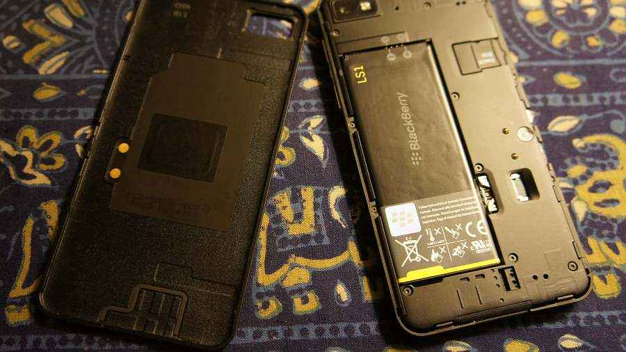
Overall, we can safely say that the Z10 has been built with certain guidelines laid down before the designers got to work – keep it simple, build it solidly and let it appeal to a wide demographic by keeping it understated. And that is exactly what the Z10 encompasses. We would give it a very strong rating for the well implemented effort.
Basic Hardware Specs
After years of falling behind the rivals in the direct spec sheet competition, BlackBerry has finally decided to step up. The Z10 gets a Qualcomm MSM8960 Snapdragon dual-core 1.5GHz processor and that is paired with 2GB of RAM. This is the same processor as seen on the Nokia Lumia 920, albeit that has 1GB lesser RAM. This chipset brings the Adreno 225 graphics.
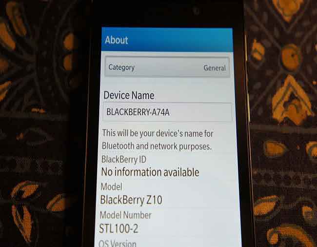
The Z10 has 16GB built-in storage, out of which around 12GB is available for the user. There is also a microSD card slot for expansion up to 64GB. You are not likely to run out of storage space on this device.
Display
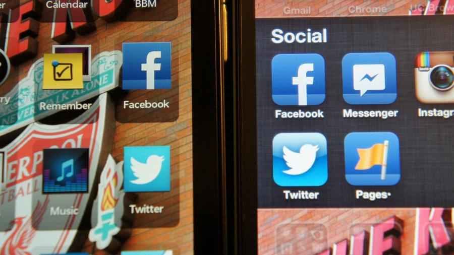
The Z10’s 4.2-inch display has a resolution of 1280 x 768 pixels. Compare this to the 4-inch display on the iPhone 5 which has a resolution of 1136 x 640 pixels. In the density stakes too, the Z10’s 355ppi is better than 326ppi on the iPhone 5. As our photographic comparisons prove, the text handling on the Z10’s display is better than the iPhone 5, since it is crisper and easier to read. However, in the brightness level comparison, the iPhone 5 display has a considerable advantage at 50% and 100% brightness levels, side by side. We tested the colour handling using the same image on both displays, and despite lower density numbers, the same image looked more detailed on the iPhone 5 and also had better colour richness. The whites on the Z10’s display have a very slight cream-ish tinge, which also has a bearing on the rest of the colours.
BlackBerry Data Plans
The biggest change, in terms of how much you pay for the data services, is that BB10 works seamlessly on generic 2G and 3G data plans. Just like on an Android device or the iPhone. This is a huge bonus, because you usually ended up shelling more for a watered down package, than what people using a generic data plan got for the same amount of money. All services – browser, mails, BBM, social networking and video calls work on this plan. However, enterprise users will still need to subscribe to the enterprise specific data plans, which will enable the BlackBerry Balance feature. Since we are not on an enterprise data plan, we have not been able to check out the Balance feature in detail.
[embed]https://www.youtube.com/watch?v=WojbfD9gDKk[/embed]
BB10 – the UI
There is no running away from the fact that BB10 requires various swipe gestures, if you are to get any work done on the phone. That takes some getting used to, particularly if you haven’t used the Playbook tablet before. This might tower as a steep learning curve for some users, but nothing that you cannot get used to very quickly. The stacked design of how apps open and how information is revealed and hidden is rather slick, and once you get a grip on the gestures, a breeze to get around.
First up, you start at what is essentially the Page 1 of the BB10 app drawer. This is very similar to the way the current iOS user interface is. Full marks for simplicity, because not everyone we spoke with likes the multiple home screen feature on Android phones. You can swipe right to left to flip through the other app drawer pages. And if you swipe left to right on the first screen, you open what is the new BlackBerry Hub.
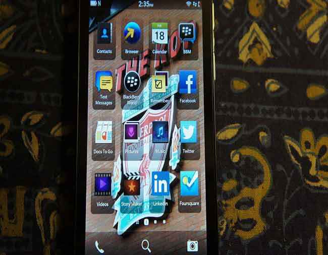
At the bottom of the BB10 app draw is a thin taskbar, with the phone app on the left corner, the search magnifying glass in the middle and the camera on the right. Incidentally, you can directly access the camera from the lock screen. When you want to unlock the display, you need to swipe up on the screen to unlock it. This setting can be disabled, which will mean you will need to follow the traditional route – press the power key and then swipe up to unlock.
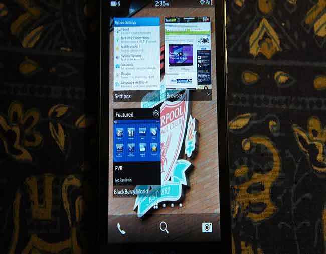
The moment you open an app, magically another screen opens between the first screen of the app drawer and the Hub. Most apps will open here when you minimize them, as widgets. The last opened app remains at the position one, and you cannot manually make any changes to this order. However, certain apps like messaging and BlackBerry Messenger will not minimize here as widgets, instead directing you to the BlackBerry Hub. Also, we noticed that you can open a maximum of eight apps in the background, and the moment you open the ninth app, the oldest open app will close automatically.
Notification Bar
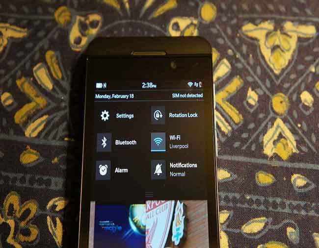
The notification bar can be swiped down to quickly access settings like Wi-Fi and Bluetooth and the Alarm, for example. Also, the main settings menu can be accessed from here. For us, the apps opened fairly quickly and we did not see any apps crash or freeze the phone UI. However, we did face the issue of the notification bar, when slid down, hide behind the very first app widget when it held within itself the BlackBerry World! With any other app placed in the widget there, this problem did not show up.
The Hub
If you happen to remember the Social app on BlackBerry OS 6 and OS 7, the Hub would seem like a much better version of the same, with additional features, and deeper integration. Rather than having to head to individual mailboxes if you have multiple mail accounts configured on the device or separately to the likes of BlackBerry Messenger, Facebook and Twitter, you get all these updates at one place with the BB10 Hub.
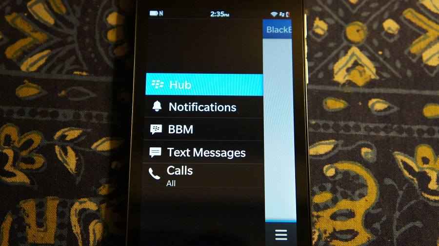
Within the Hub, swipe left to right to open the card that lists all the accounts as tabs, vertically. The Top tab is supposed to have all the updates listed, while the individual account tabs holds the updates for that particular network. Having all updates in the main Hub tab was a bit overwhelming, so we turned all accounts off there, and left it to only receive critical updates from Blackberry. Personally, I prefer heading to the individual account tabs for particular networks – better filtering for quicker access.
The messages and mentions figure fairly smoothly on the Hub. We had people tagging us in photographs and web page shares, and all the previews and summaries opened within the Hub. Also, if someone had commented on the status, that showed up for Facebook.
The idea for the Hub is very neat, and very well implemented in BB10. All our mail accounts, Facebook and Twitter were all integrated seamlessly. The one swipe gesture to get to the Hub from the lock screen makes getting to the new messages simpler and quicker.
Contacts
This is a huge change over the way contacts were handled by the previous BlackBerry OS versions. Now, you can sync contacts from Google, Hotmail, Facebook, Twitter and LinkedIn. At the time of setting up each account, you can configure whether you want to sync mails, contacts and calendar - individual toggles for each.
Since all my contacts are on Google, I set that to sync mails and contacts on the primary account. On the first attempt, contacts synced immediately, but there were surprisingly some duplicate entries. I double checked on the Google account, but there were no duplicate entries for the same contacts. Just to double check if this is a consistent problem, I deleted the account and then set it up again, with the same settings. This time, the duplication problem did not replicate.
If you like tagging your contacts with their Facebook and Twitter accounts, BB10 makes all that very simple. For the contacts on the phone that had the same as their Facebook accounts, information was tagged seamlessly. Even if it is for the sake of making the phonebook look better with the contact images!
In the contacts applications, at the end of it, there are just too many listings! The best method is to clean it up by turning off the display of contacts from Facebook and Twitter. Alternatively, within the contacts app, you need to swipe left to right to open the card that stacks all the synced accounts, letting you access contacts from those individually.
Mail
This is the primary point of contention for anyone who wants to upgrade to BB10 or switch – is it as good as the older OS? The answer to that is both yes and no! Setting up accounts is simpler in BB10. The integration with the Hub means you access mails quicker without having to exit one mailbox and enter another.
Surprisingly, we faced a lag in the time the mailbox was refreshed, on our company account, which is essentially the corporate version of Gmail. First up, push seemed to be disabled, and the sync would only happen every 15 minutes – the time I had set, and is the lowest interval option. However, push mail worked seamlessly for my personal Gmail account. I distinctly remember that the company mail had the push feature available when on the BlackBerry Bold 9780 running OS 6.
Beyond this issue, we like the simplicity of setting up accounts, and accessing them in one place.
The apps
The Z10 comes preloaded with Facebook, Twitter and LinkedIn. Incidentally, these apps are made by BlackBerry, and not by the networks themselves. These are real apps, and not just links that would open the web browser. The integration with Hub adds that extra amount of convenience – head straight to the Hub, rather than search for the app in the drawer and access each individually.
The redone BlackBerry World may be a big change for the markets where the store can offer additional content and services, but in India, it is still restricted to apps and games. The redesigned user interface is neat, but nothing that stands out in a crowd of application stores.

Speaking of variety, we were fairly excited to check out the likes of Whatsapp and Skype for BlackBerry 10. However, despite having shown these off before and at the time of the BB10 launch, these apps are yet to make their way on to the platform. Facebook Messenger is another application that is missing. Some users may not be too hassled by all this, but the younger crowd will surely be put off. The BlackBerry Boys generation, attracted to a platform that offered all popular social networking and IM apps, in addition to BlackBerry Messenger, will feel a little shortchanged.
Dropbox has been integrated very nicely with the File Manager, allowing you seamlessly shift between the phone storage and the cloud storage. No apps yet though, for Microsoft Skydrive or Google Drive.
BBM
The application remains the same at the base of it – chat between friends who are in your friend list only because you added them via the PIN, shared by explicit consent! However, there has been a redesign. You can now see the contacts in the list form, or in the thumbnail form.
While chatting, the features of “D” and “R” notifications remains as it is. Irritatingly, when you send a message to someone, the keyboard does not automatically disappear, and you need to tap somewhere on the screen to send the keyboard away and return to the friends list. A return key, on screen, within the UI, would have been very useful in scenarios like these. Also, if you copy a message from a friend and paste it in the chat window of another friend, the first sender’s name also gets copied!
Additional features include BBM Voice and BBM Video. These are two additional methods of chatting with your friends. BBM Video is pretty much like Apple’s FaceTime, but the additional ability to share screens being something that you may use to share data and pictures with the other party on the call.
Keyboard
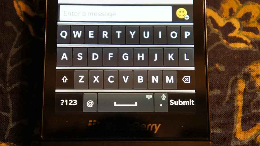
There was a lot said about the redesigned on-screen keyboard for BB10, at the time when the enticing photos of the UI were being leaked on the internet. The idea behind the redesign was to replicate the way a physical QWERTY looks. Hence, you can notice the silver borders between rows, just like on the BlackBerry Bold Touch 9900. Key size is adequate, but there are times when you feel that the keys are placed too close to each other. There is, and will always remain, a difference between a physical keyboard and the on-screen one. The word prediction is fairly active throughout, and tends to learn any additional lingo words fairly quickly. Honestly, between this and the word prediction on the iPhone, the Z10 tends to not demand a word replacement more than once after you have taught it, while the iPhone repeats the same demand over and over again. This keyboard is reasonable for precise and fairly quick typing, but for anyone with fingers slightly on the fatter side, you will need to be slightly more careful.
Web browser
The browser for BB10 is blindingly fast. We had expected this to be fairly quick, but the sheer difference between this and the Safari on iOS and Chrome on Android is visible to one and all. The Rightware Browsermark test on the Z10 browser scored 3485, which is a good 1000 points ahead of the iPhone 5 and steadily at least 1200 points ahead of the best Android phone.
Even when loading the same web page over 3G, the Z10 browser was slightly quicker even for the heavier pages. Even our own Thinkdigit.com page loaded faster on the Z10. This is a huge improvement over the browser on the previous BB OSes. The flash support makes this better than Safari straightaway.
Camera
Camera performance has never been a strong point of BlackBerry phones, but that could change considerably for the better, with the Z10 at least. What we have is an 8MP camera at the back of the Z10, and a 2MP video calling camera at the front. There is a single LED flash, and the rear camera can record 1080p HD videos.
The Z10 camera app can be accessed multiple ways - the shortcut on the lock screen by long pressing the icon, by selecting the app from the drawer or by tapping the camera icon on the dock below the app drawer and the oft open widgets page.
The Z10's camera opens up fairly quickly and is ready to shoot than quite a few high end Android phones. The feature set is limited, but the rapid shutter speed means you will usually not miss out on a shot! You have the tap to click feature on the entire screen when the camera is open, and it is fairly easy to accidentally tap and click while shuttling in and out of the settings menu. There is no tap to focus, and despite fairly quick shutter speeds, the focus can sometimes take a bit of time.
We directly pitted the Z10’s camera with that on the iPhone 5, and the Z10 proved to be surprisingly close to the iPhone 5 camera. If you look at the comparison shots of the flower, the one taken by the Z10 looks slightly less bright than the iPhone 5, but the surprising amount of crispness and detail is something that is indeed very good on the Z10’s shot.
|
|
|
If you zoom in to the same shot, there are areas where the Z10 and the iPhone 5 trade the top spot for which one offers more detail.
Close up, the BlackBerry Z10’s camera is actually better than the iPhone 5. The shots taken by the Z10 look more even in terms of exposure and colour.
|
|
|
For the landscape shots, the Z10’s camera offers more natural colours, while the iPhone 5 has a slightly warmer tone to it. If you look closely, the Z10 offers more detailing in the ground where the cars are parked, and also for the text on the advertising on the building side.
|
|
|
These are surprisingly good results from the Z10 camera, something that has us all surprised at how close it runs the iPhone 5, and even beats it in some cases. The basic feature set could be a bit of an issue, and it misses out on HDR, for example. This will hurt low light performance to a certain extent.
Not only this, there is the brilliant Time Shift feature on the Z10 camera. It can take a series of shots at very close intervals, and you can run through the timeline to select which one you like the best for the final image. Very good if you are taking moving objects. An illustrative example of the Time Shift feature is given with these images.
Call Quality
The Z10 has pristine call quality, if you are in a signal area that offers anything more than 40% signal. Even with 2 bars on the phone, the call does not drop. The Z10 held signal at the same place where the HTC One X refuses to connect a call. The earpiece is loud, yet keeps the audio very soft. It is fairly similar to the iPhone 5, and that is actually a very good thing.
The ringtone volume would have to be set at the maximum most of the time because the built-in speaker is fairly soft, and volume may not be enough if you are in a noisy environment.
BlackBerry Link
The new phones will not work with the older BlackBerry Desktop Software. That has been replaced with the Link software for the desktop. Compared to the previous version, the new Link seems more focused on the fun elements. The handshake with iTunes is good if you are looking to transfer a lot of music to the device. However, I could not personally find a way of syncing my contact file, in CSV format to be precise, through the Link software. If this is a phone that is not aiming to alienate the business users, this will have to be ironed out very quickly. Assuming that everyone will have a prior backup of an existing BlackBerry device is also a wrong way of going about it. Loyalty only takes you so far!
Battery Life
We were a tad surprised that BlackBerry only packed in an 1800mAh battery, and were quite honestly a little apprehensive about how good the backup times will be. As a primary phone, with mails, IM and BBM used generously, and with quite a few phone calls, the Z10 lasted from full charge at 8am on one day to 12:30pm the next day, with the airplane mode active at night. This is not bad at all, but had BlackBerry packed in a bigger battery, it could have really had a point to beat down the rivals with.
Verdict
With the Z10, BlackBerry seems to be turning a corner, but the company runs the risk of understeering around the bend. The full-touch Z10 is a very good smartphone, looking at the hardware, the specifications and the potential – hints of which can be extracted from the spanking new BB10 OS. The camera is excellent, and surprisingly matches up to the iPhone 5. You do not need to pay separate for a BlackBerry data plan with BB10 phones. Hub integrates all your mail and social networking updates at one place, and that is rather cool.
However, the BB10 OS has some bugs that need to be ironed out soon enough. Also, if apps like WhatsApp, FB Messenger, Instagram and Skype are important for you, then you will be disappointed. The Z10 is good start, and further BB10 updates and devices are something that BlackBerry can build on this year. Maybe the Alicia Keys album on the phone may sway your decision!
The BlackBerry Z10, at the price of around Rs. 44,000, will only appeal to the hardcore BlackBerry users who always wanted to upgrade to a full-fledged touchscreen BB phone. For everyone else, this will be a bit of a turn off. Considering you have the iPhone 5 available for a similar price, and the very powerful HTC Butterfly, the Z10 is bound to have a tough time. Not its own fault though. The Z10 is good start, and further BB10 updates and devices are something that BlackBerry can build on this year. Right now, the Alicia Keys album on the phone may sway also your decision!
[ad_2]
Source link




Post a Comment