Vivo V7 detailed review
Vivo phones are generally selfie centric and the Vivo V7 is not any different. As you may have deducted from the naming scheme, the V7 is the smaller version of the V7+ we reviewed earlier. The smartphone features pretty much the same specifications, but at a lesser price tag. So technically, this should be a better deal, right? Well, that depends on a lot of aspects in addition to your affinity to selfies. On paper, the Vivo V7 seems like a good enough device and seems to be ticking all the right checkboxes. The phone is powered by an octa-core SoC, features 4GB RAM, has 32GB storage, even has an 18:9 aspect ratio display, basically it offers all the regular hardware you may find on any other smartphone these days. However, the biggest distinction this phone has and might enjoy in times to come is its small (pocketable) size, but is that enough? We have been using the phone for quite some now and here is our detailed review of what it offers.
Build and design
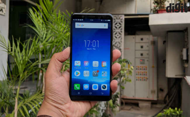
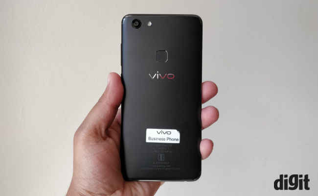
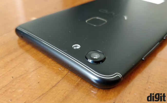
The phone feature a 5.7-inch almost bezel-less display which makes it comparatively the same size as a standard 5.2 or 5.3-inch smartphone. The smaller size not just more ergonomic to use in one hand, but also looks better (or cute). Vivo has basically has kept the design almost identical to the V7+. The phone has a plastic back, which on paper seems inferior to most of its competitors which offer metal unibody build. That said, the chamfered edges and the fake antenna lines both top and bottom of the phone give it a premium look. Also, unless you drop the phone, you won't really find the difference.
Display and UI
The taller 18:9 aspect ratio display also plays a big part in the looks of the phone and plays its part well. The point being, it is a better-looking device than more performance oriented devices in the same price category. However, practicality and value for money are two essential cornerstones of the budget-oriented market and that’s where the Vivo V7 fall short.
You are getting a 5.7-inch display on this phone with a HD+ resolution (1440 x 720p), which considering the price of the device is completely outrageous. Hence, the display is not as sharp as some of its competitors. That said, unless you are ticked off by the lower sharpness of the display you won’t find the display lacking as such. Being an LCD panel, it has a decent colour fidelity and the viewing angles are good.
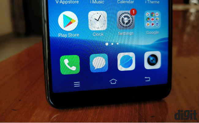
Still, we at Digit agree that any display with a size more than 5.5-inches should have at least a 1080p resolution. The touch response is also satisfactory, but we did find a delay in animations, which I believe is a downside of using a heavy UI.
The UI we are talking about is FunTouch OS 3.2, which is layered on top of Android 7.1.1 Nougat. First of all, no phone [maker should be excused (now) using an older operating system and Vivo should strive to push Android Oreo to at least its 2017 smartphone portfolio at the latest. We are saying it's quite heavy because, it is always using 2GB or more RAM even after clearing the recently opened apps.
As for the interface, it is business as usual. FunTouch OS 3.2 remains a really good design rip-off off iOS. Vivo has tried to make the UI design as identical to iOS as possible. Right from the iconography to the quick toggle menu, which appears via a swipe from the bottom. Even additional settings of native apps are located in the main settings menu. All that said, everything remains functional and easy to use, once you go past the slight learning curve.
Performance
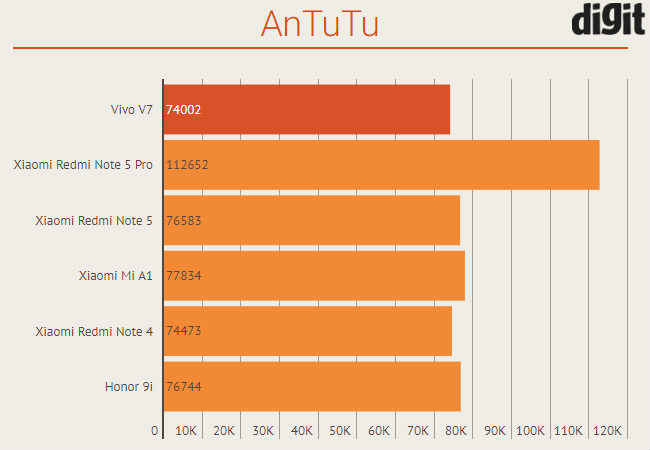
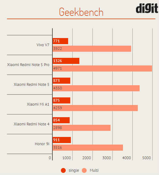
This brings us to the performance of the phone which comes from the same Qualcomm Snapdragon 450 SoC, we saw on the bigger sibling. You even get the same 4GB RAM and hence the performance of the device also remains quite identical. The Snapdragon 450 remains just as powerful as the Snapdragon 625 we recently saw on the Redmi Note 5 in terms of synthetic benchmarks. However, the Vivo V7 does not feel snappy enough for a smooth multitasking experience. Whether you are jumping between apps or just trying to open an application, the phone feels slow, especially compared to other devices at the same price. However, we had no major issue with the device and that includes gaming performance. You can play whatever games you may like, but with occasional frame drops and long loading times.
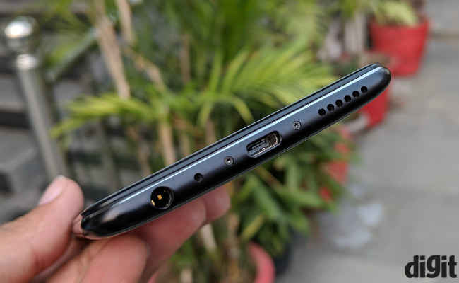
Audio quality via the single speaker at the bottom is adequately loud but could have been louder as it gets easily muffled in a jeans pocket. We appreciate Vivo's effort towards improving audio quality for music enthusiasts and the V7 stands out here. The phone offers a more satisfying audio output via headphones than most phones at its price.
Battery life
The efficient octa-core processor and the 720p+ display also means that the battery life is commendable. The phone can easily last a day's worth of usage without any issues. The phone does use more battery while gaming but that is a given on any smartphone these days. Light users may even get more than a day out of the phone but not more than that.
Camera
As you may have noticed till now (by this review), the Vivo V7 is not a particularly outstanding phone. It just an average phone with regular specifications and equally mainstream performance. However, the silver bullet on which Vivo is putting its faith in is the camera, especially the front one.
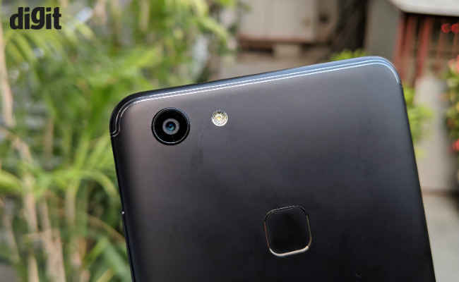
The 24MP front-facing snapper is the same unit we saw on the bigger cousin and hence offer the same image quality. It is at best decent, offering an almost true to source colour reproduction. The focus remains softer by default with a decent level of details, which seems to be the case with most selfie-focused smartphones. While the large megapixel count allows for more data in the image, all images shot from the selfie camera have a bit of noise. This noise grows exponentially in low light images, rendering image unusable under low light conditions. On the opposite end of the scale, while taking pictures under bright outdoor conditions, there is visible highlight clipping. That said, most of these selfies are meant to be posted on social media platforms and the images come out 'good enough' to be posted on social media platforms. You also get a software bokeh on the front facing camera which is good but we have seen better.


The rear camera, on the other hand, does not produce any better images. The images we took with the rear camera while looked good on the phone itself, turned out to be just decent on a larger display. While Vivo’s camera algorithm produces colour better than most, it struggles to keep the details in check. We do like the fact that just like the V7+, the subject separation is good on this camera, but since its launch, the competition has caught up and even surpassed it. The software enabled portrait mode is again good enough, but in recent times we have seen better.


Bottomline
Vivo and Oppo are peas in a pod. Both companies have been playing the selfie game for too long and the Vivo V7 is just another phone which does the same. It is not a big upgrade in terms of the selfie game over what Vivo has been offering up till now but it does have a newer smaller form factor which we personally prefer. You won’t find the performance lacking per say, but it can’t compete with the Xiaomi Redmi Note 5 Pro either. Our internal tests indicate that the Redmi Note 5 Pro takes better selfies than any other phone in the sub-15K category, the Vivo V7 included, but good luck buying one.
All-in-all the Vivo V7 is just another phone which strives to be more but can’t go beyond its inhibitions. The phone was supposed to produce a “clearer selfie”, which it does to some extent but considering the competition, is not really pushing any boundaries.
[ad_2]
Source link

Post a Comment