Microsoft Surface Go detailed review
2018 was without a doubt a busy year for Microsoft. Starting with the Surface Pro in late February, it decided to launch its entire Surface line-up in India. The list included the Surface Laptop and Surface Book 2. But that’s not all. Just before the year ended, the software and hardware giant also tossed in the much-rumoured Surface Go, a miniaturised and less expensive version of the Surface Pro. Clearly, Microsoft wanted to show potential iPad buyers that they had a choice. But is Microsoft succeeding on that front? Read on to find out.
What’s in the box: Not a lot, really
Let’s take a look at what Microsoft has to offer with the Surface Go. It’s a ten-inch Windows tablet with a kickstand, just like the Surface Pro. It comes powered by a 2017 14-nanometre dual-core Intel Pentium Gold Processor 4415Y clocking at 1.60GHz. For Rs 37,999, you get the Pentium mated to 4GB of RAM and 64GB of eMMC storage. However, if you shell out some more and invest Rs 49,999, you get the same Pentium chip mated to 8GB of RAM and 128GB of NVMe solid-state storage.
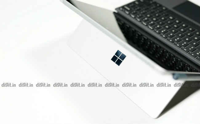
If you want a detachable magnetic keyboard with either variant, the Surface Go Signature Type Cover is an extra Rs 7,829. If you crave an active stylus for drawing and scribbling notes, the Surface Pen is an extra Rs 9,390 or so. As software, the Surface Go gets Windows 10 in S Mode, which means only apps from the Microsoft Store can be installed. If you want to install traditional Win32 applications, you’ll have to leave S Mode, which is a one-time move. A return to S Mode will necessitate a fresh installation of Windows 10. The Surface Go gets a Surface Connect port for power, a 3.5mm audio jack for headsets, a microSDXC card slot, and a single USB Type-C port.
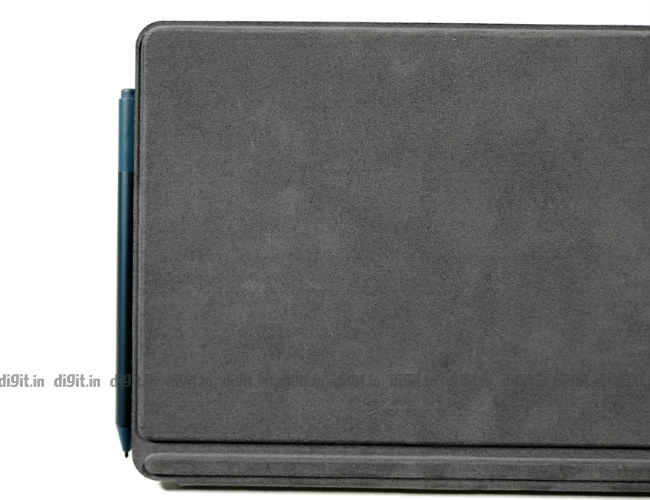
On the face of it, the Surface Go is definitely an expensive piece of tech, especially for a small portable computer. But even with its Signature Type Cover slapped on, the Surface Go simply cannot be looked at as a typical laptop, or even a convertible laptop. It’s assuredly a handheld tablet with optional keyboard accessories, just like the iPad. In comparison, the iPad starts at about Rs 28,000 and goes all the way up to a lakh rupees for the Pro model. While the iPad’s primary goal is to provide easy content consumption through iOS, the Surface Go aims to be a tablet like it by running Windows, which was originally written for desktops and laptops with keyboard and mouse input.
Build and Display: Follows the Pro
Yes, the Surface Go resembles the Surface Pro greatly but is perceptibly smaller than it when held in the hands. It’s as if Microsoft decided to cut down the size of only the display unit of the device while building the Surface Go. I say this because, while the display has noticeably shrunk, the bezels remain obtrusively thick. Like its bigger brother, the Surface Go gets an all-metal body and a kickstand that’s rather hard to deploy when one of your hands is busy. Handling the tablet becomes all the more tricky when the Surface Pen and Signature Type Cover are attached to it because there’s no place to grip the device. On the bright side, the buttons on the top side of the tablet’s body are sturdy and easy to press.
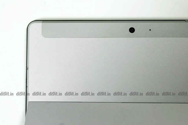
The front and rear cameras on the device are capable of taking fairly good photos with a surprising amount of detail. The front camera is used to perform Face Unlock during sign-ins. Our test unit, which is the top-end variant with 8GB of RAM, successfully unlocked approximately four out five times when the device was held directly in front of the face. On the whole, the Surface Go seems well built. It’s no harder to hold one when compared to an iPad, especially with its weight being just a touch over 500g. I only wish Microsoft hadn’t sent it out of the factory with such thick bezels; it seems outmoded and comical in an age when bezel-less display design is the in-thing. Here’s the link to a Windows Central article explaining why the Surface Go’s bezels are so thick.
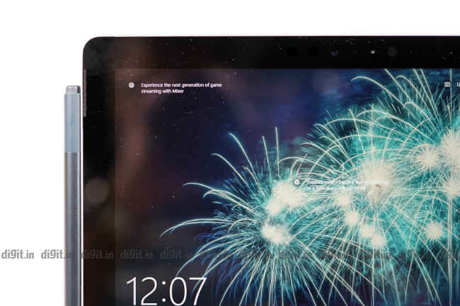
The PixelSense touchscreen display of the Surface Go measures ten inches diagonally. It’s protected by a Corning Gorilla Glass 3. It has a resolution of 1800 x 1200 pixels and an aspect ratio of 3:2, which is healthy for a display of that size. By default, Windows scales everything on the screen to 150 percent in relation to the device’s native display resolution. At 125 percent, text is still readable with some amount of squinting. At 100, you can’t read a thing. On our test unit, I set the scaling to 150 percent for use in tablet mode but switched to 125 percent when I had to browse on desktop sites. The overall feeling I got was that the display was far too small for Windows elements like the taskbar, File Explorer, Task Manager, etc. even in Windows’ Tablet Mode. The Surface Pen, however, worked well with the PixelSense display for drawing and scribbling notes in OneNote and Paint3D
Keyboard and Touchpad: Small but precise
The optional Surface Go Signature Type Cover latches onto the lower side of the Surface Go’s body as soon as it’s brought close to the tablet’s body. While the keyboard frame feels somewhat flimsy because it’s designed to be light, the backlit keys on it have the right sort of character. The keyboard takes some getting used to because the keys are incredibly small. But once you’re used to its size, typing becomes fairly easy. But the overall comfort level only allows you to type short documents and emails.
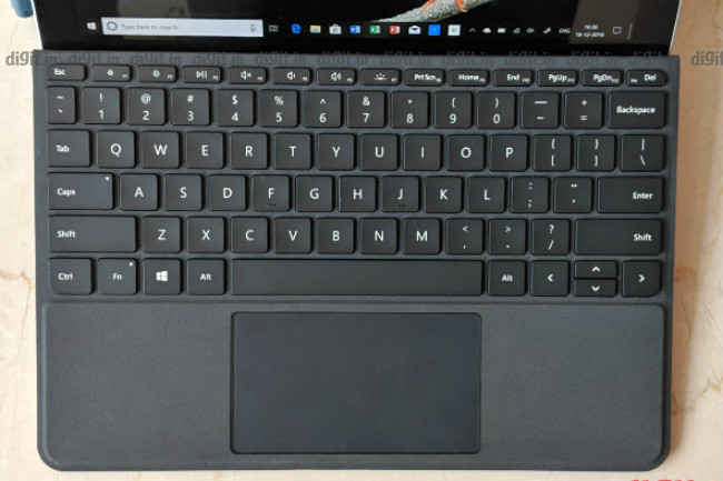
In my experience, there were a couple of irritants on the test unit’s keyboard. The first was that the keyboard spread itself out wider than the display (because of the thick bezels), so it felt like I was typing on an old Apple PowerBook Duo. This made the tablet appear smaller than it is. The other was that the top row is especially narrow. I would often graze the display (and make some unintended touches) in an attempt to hit one of the function keys.
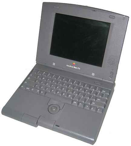
Surface Go's optional keyboard is wider than its display, like on an old PowerBook
The touchpad below the keyboard is a precision unit. It works smoothly and reacts exactly as you’d want it to. Multi-finger taps and swipes are a breeze to use. At times the touchpad may feel a bit small but it’s not a very constricting feeling in the long run. Clicking the touchpad for left- and right-mouse clicks is an easy affair. Microsoft certainly has done a great job with the Surface Go’s touchpad.
Performance: Up to the mark
The Intel Pentium Gold Processor 4415Y on the Microsoft Surface Go is sufficient for most everyday tasks, like emailing, document editing, video playback, and web browsing. There are moments when the Surface Go hiccups and displays signs of stuttering but that’s only when you ask it to do multiple things at the same time or in quick succession. For example, hitting Win + Tab together to pull up Task View while the processor is already loaded with tasks causes a noticeable stutter.
Our test unit, with its 8GB of RAM and 128GB of NVMe solid-state storage, was able to handle a fair amount of stress. I was able to switch between apps like Chrome, Word, Excel, WhatsApp for PC, OneNote, Paint 3D, and multiple instances of File Explorer across multiple virtual desktops without any trouble. There was that occasional jitter in animation but it was nothing frustrating. I did not venture to play games on the Surface Go though. The Intel HD 615 internal graphics card does the job for videos but isn’t suited to gaming.
Software: Needs a lot of work
From my experience with the test unit, I learnt that the Surface Go’s display isn’t necessarily small for Windows 10—rather, Windows 10 is still too big for small tablet displays. The 33-year-old operating system has yet to adapt fully to the small screens tablets come with. It’s true. Allow me to tell you just how painful a task so simple as renaming a file can be on the Surface Go using only screen touches. I booted the test unit up in landscape orientation, enabled Tablet Mode, and set the scaling to a recommended 150 percent.
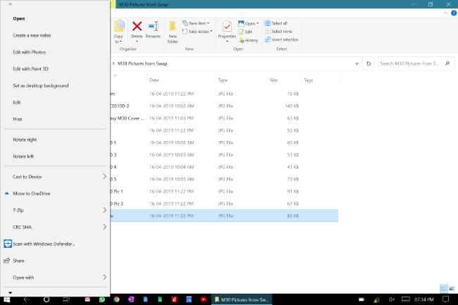
Context menu can't be swiped to scroll down
In a maximised File Explorer window, I long-pressed a file icon to bring up the context menu, which kept switching sizes every single time it popped up for some strange reason. The option to rename is usually found at the bottom of the context menu in Windows. So I should be able to swipe up to reach the bottom of the menu—right? No. I was forced to press a tiny downward arrow at the bottom of the list repeatedly to scroll down. When I finally managed to tap on Rename, the filename was highlighted for renaming but the keyboard didn’t pop up automatically.
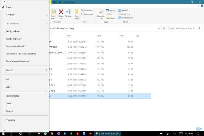
You need to press that tiny downward arrow to scroll down
When I tapped on the keyboard icon on the right side of the taskbar, the keyboard promptly presented itself but covered a whole half of the screen, including the highlighted filename. I had no choice but to start typing the new filename blindly into the keyboard. Hitting backspace took me back to the previous folder location. Retrying the process in portrait orientation worked better but was a pain nonetheless to find the option to rename the file. Performing other tasks using only touch, like browsing and reviewing documents, was not all that big a pain. Still, some Windows elements, especially in-window buttons, still begged to be used with a mouse and keyboard.
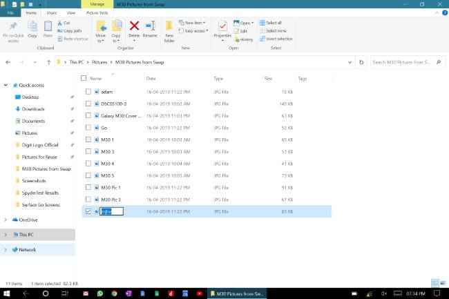
Highlighted text doesn't pop the keyboard up automatically
The point is that Windows is still far from being easy to use on a tablet. Microsoft is doing its best to promote Windows 10 as a hybrid PC + tablet operating system but the truth is that it’s just not one yet. Even Task View—a feature made well after Microsoft decided to unite PC and tablet UI in Windows 8—requires the user to hover the mouse pointer over a virtual desktop thumbnail to see what windows it contains.
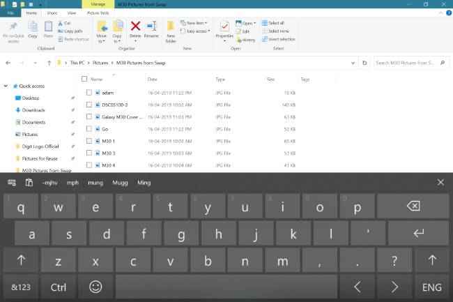
Keyboard eats up half the screen but the content behind doesn't move up
Apart from these UI design issues, I found other irksome software glitches on the Surface Go test unit. The default camera app in Windows 10 shut down after two taking two photos in succession, displaying an unknown error. On an average of three out of five times, the display brightness control failed to work. I was finally able to get back control after reinstalling the display driver in Device Manager.

Camera shut down after two shots
To sum things up, Windows 10 on a ten-inch tablet with touch input only is a really bad idea. You’ll have to get that optional Signature Type Cover if you want to be productive with the Surface Go. And that means spending thousands of rupees more just for a keyboard and touchpad. What’s more disappointing is that the Surface Go fails to deliver a seamless Windows experience, considering that it’s from the makers of Windows itself.
Summary: A tablet reserved for the Windows loyalist
Let’s sum the Surface Go up. It’s a ten-inch tablet powered by a 2017 Pentium chip commanding a price of Rs 37,999 for the lowest variant. For that price, neither the Surface Pen nor the Signature Type Cover is included with the device. The tablet’s performance is good for most daily tasks but Windows 10’s ungainly UI on a display that small is capable of hindering your productivity.
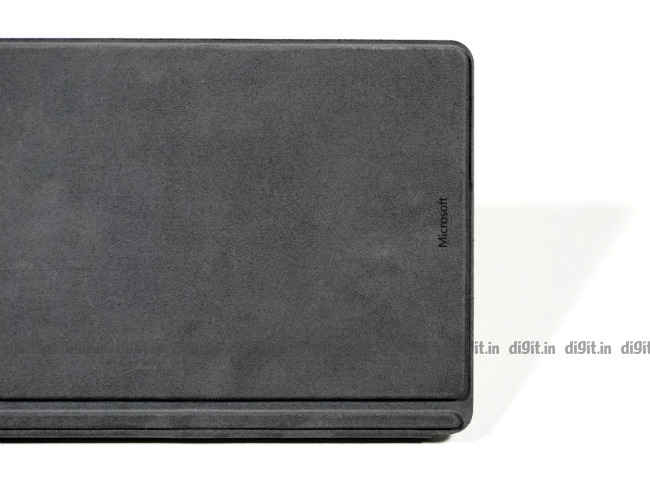
The Microsoft Surface Go is for you if you simply can't do without Winodws 10 on your next tablet. Your other alternatives include the Apple iPad range, which was recently updated with the refreshed iPad Air and iPad mini, and the Samsung Galaxy Tab S4.
[ad_2]
Source link

Post a Comment