
We have noticed Firefox progress slowly from the Firefox 3.7 days to now (there was originally supposed to be a Firefox 3.7 between 3.6 and 4.0), seeing each piece of the plan fall into place. Is Firefox 4.0 everything Mozilla expected it to become? Perhaps not, but as the biggest change yet to come in the history of the browser, it is no less significant.
Firefox 4 will also probably be the last major change in the history of the browser. Mozilla has recently decided to move Firefox to a faster release cycle like that of Google Chrome. Why you may ask? Are they just trying to copy Google Chrome? Is this a war of version numbers? No!
A good idea is good no matter the source. Releasing versions faster means users get new features in smaller, frequent doses rather than one bundle after a long time. Firefox 3.6 released over a year ago. At that time it was not far behind Google Chrome in JavaScript performance, while by the time Google Chrome 9 came out it was 1/3rd the speed. I have used the nightly builds of Firefox a lot, and a number of improvements in Firefox 4 have been stable for quite a while. If Mozilla has released new versions of Firefox as they came, they would have made the browser much more competitive.
Another point of contention here is that these releases are labelled as Firefox 5, 6, 7 while Mozilla could as easily have called them Firefox 4.1, 4.2, 4.3, each shipping on schedule. In such a case though, there would still be a concept of major and minor releases
We have covered quite a few of these changes as the browser developed over the course of 13 beta versions, now its time again for a recap, and a look at the final product.
A fresh new look
While the browser's UI was refreshed with each new release, the basic UI remained the same till Firefox 3.6, the same locations for tabs, similar menus etc. Individual aspects such as the download manager, and the add-on manager went through bigger UI changes though.
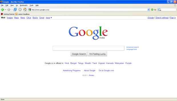
Firefox 1.5
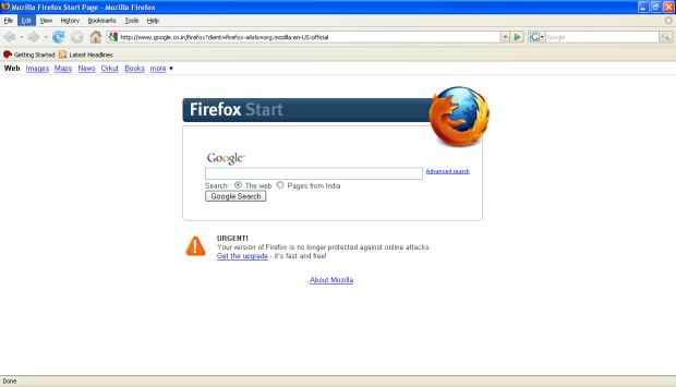
Firefox 2.0
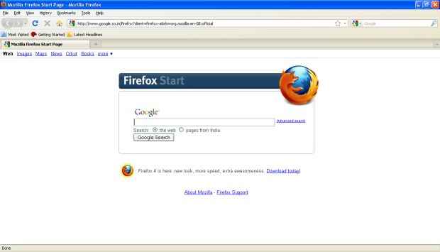
Firefox 3.6
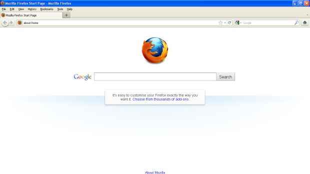
Firefox 4.0
Current trends dictate a smaller UI footprint, as websites take over many of the functions that we have usually reserved for browsers. This is especially true of web applications, which usually remain open in the background as people browse the web. Once such as website it opened, you usually have little need for a back, forward and reload buttons, or even the address bar. Firefox 4 optimizes UI space for the content that need to be displayed.
No menus
While menus do have numerous features that cant be exposed on the UI, those features are diminishing in their use. The few options that people use most have been moved into one unified menu with all useful options within reach.
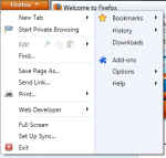
The new Firefox menu has two columns, putting options in closer proximity of the your mouse when you click the Firefox button. Furthermore, the old menu-based shortcut keys still work. Clicking Al F will bring up the menu from hiding and open the file menu.
Menus are shown by default on Linux, however hiding them is a simple matter of right-clicking the menu-bar and deselecting "Menu bar".
 |
| Firefox 4.0 on OpenSUSE 11.4 (default) |
 |
| Firefox 4.0 on OpenSUSE 11.4 (menu disabled) |
While the menus have been replaced by the Firefox button, there seems to be no keyboard shortcut for opening the Firefox menu. Oh, well, the old menu still works.
Tabs on Top
 Tabs-on-top are a much better paradigm than the older tabs below the location bar system. Tabs on top give a clearer impression that the location bar, and browser controls apply to the current tab, and are manipulating the content they are associated with rather than the browser as a whole.
This also makes it possible for hide the address bar for pages that don't really have an address, such as the add-on manager page.

If you maximise Firefox on Windows, it will move your tabs to the titlebar, further compacting the interface.

No bookmarks bar by default
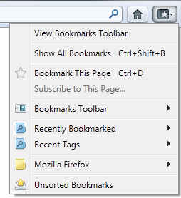
Adding bookmarks was simplified quite a bit in Firefox 3 with the introduction of the "star" button in the location-bar. Clicking on the star instantly bookmarks the URL, and clicking on it again lets you add tags, change the folder etc. Firefox 3 also introduced searching through your bookmarks from the location bar.
With these two features, you didn't need to click on a bookmark or access it from the bookmark menu. just start typing the title or URL of the website and Firefox will find it for you. Many people wont even need to use the bookmark bar because of this and it will just end up taking space on the screen.
The old bookmarks menu (which is also hidden by default on Windows) has a direct replacement in the form on a Bookmark button, which on clicking shows you the good old bookmarks menu, along with an option to enable the bookmark bar. So if you are one who does use the bookmark bar, bringing it back is a simple matter.
No status bar
This is one change that has ticked a lot of people off; the good old status bar is no more. The status bar was useful for, as its name suggests, displaying the status of the page however add-ons also used it to display their icons.
Mozilla has ensured that no information is lost here, by accommodating the status and add-on icons in other places. For the status messages (connecting, ready etc) you have the new animated icons. Although the exact animations are theme and OS specific, the connecting and loading statuses are now depicted by revolving icons, with the connecting icon revolving counterclockwise, and the loading icon rotating clockwise. If you are reading this article on Firefox, you can see the animated icons below, on other browsers they will appear stationary.
 Connecting
 Loading
For those who like a little more detail, like the address of the website Firefox is connecting to, Mozilla has implemented the kind of hovering status bar that is there in Google Chrome. Essentially the bar only pops up when Firefox is connecting and hides away when done.

Additionally, if you move your mouse over the hovering status display it doges over to the other side. It's not as charming as it isn't original, but it is a good feature nonetheless.
Mozilla has also added the add-on bar just for them to display icons. These bar is originally hidden, saving further screen space, until you install an add-on that uses it.

New add-on manager
The add-on manger has seen a significant overhaul, and not just in looks, but in features as well. The Firefox 3 add-on manger allowed one to search for add-ons straight from the add-on manager, which was great, but of limited use. Chances are if you are installing a new add-on, you will need more details than can be afforded by such a small window. Unless you already know which extension to install, you'll probably use the web interface.
The new UI doesn't suffer from this defect, as you can search for locally installed add-ons in addition to add-ons from Mozilla's database. When you search for an add-on you can see much more detail now, and can even click on the "more" button to see further detail about the add-on, including a link to the add-on's homepage, author's page on the Mozilla, and its reviews. If the add-on author asks for it, a contribution button will also appear.The details page also includes the download count and rating which can be useful indicators for an add-on's quality.
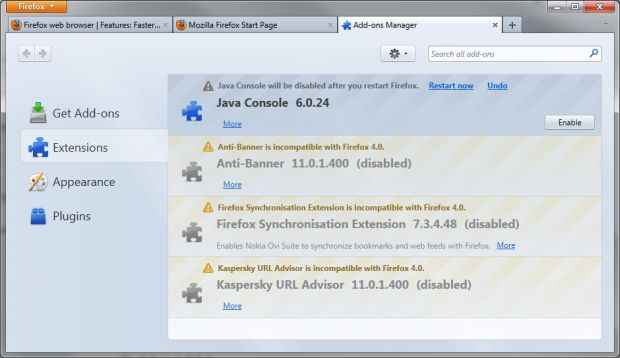
Firefox 4.0 Add-on manager
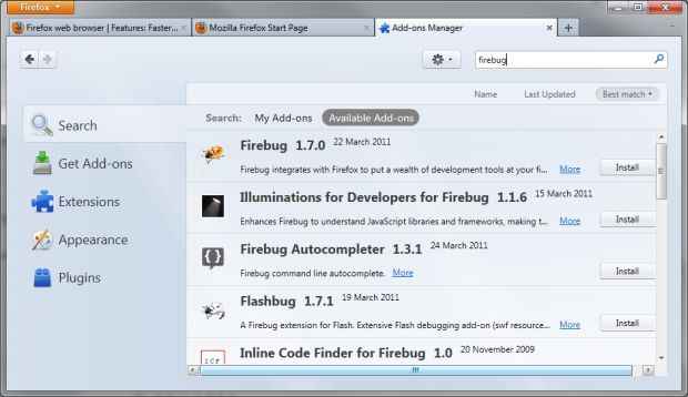
Firefox 4.0 Add-on search
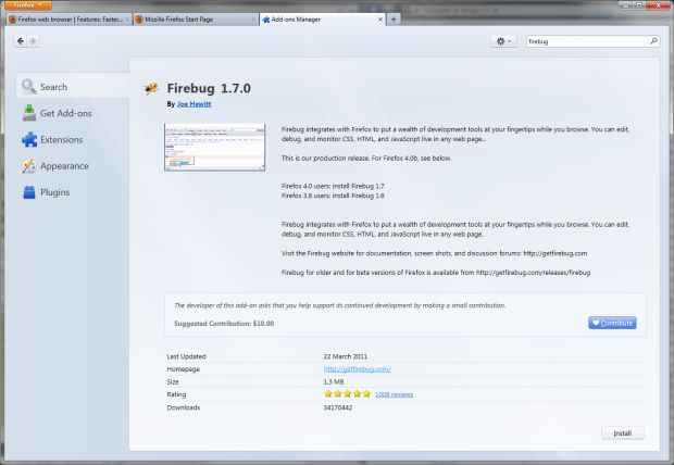
Firefox 4.0 Add-on details page
One annoying aspect of the Firefox add-on system is that it downloads an add-on before asking for your permission to install it. This can mean wasted bandwidth on an add-on you would have declined to install anyway.
Other subtle UI changes
There are a number of other subtle changes that come with Firefox 4, such as:
 Combined stop and reload buttons — They no appear at the end of the location bar. It makes sense combining these buttons since they are both related in function and don't need to be used together.
- The home button is moved to the right of the search bar — I for once never find the home button useful, and hide it at the first opportunity
- Personas — this isn't a new feature, it was added in 3.6 and was available even before that as an add-on. One new nice effect on Windows, thanks to Firefox managing the title-bar now, is that now the entire browser including the title bar is skinned, which just look cool!

 New style drop-downs — now when you install an add-on, make a bookmark, click on a sire's security id, share your location with a site etc. Firefox will show a new style of dropdown that makes it a little clearer where the request is coming from. The bookmark dropdown for example will point to the icon originating the request. For example if you try to use the location feature in Google Maps, a dropdown permission request will show up. you can continue using the site and the the dropdown will hide itself leaving behind a geolocation icon that you can click later on to give the site the required permission.
 Non-modal JavaScript alerts —In Firefox 3.6 and before, if a website displayed an alert message such a message would block the entire Firefox window, even though the message only applies to the originating tab. Now such messages are displayed only on the tab from which they originate.
Features galore
While the UI has been minimized substantially, the number of features on the other hand, have only gone up. Two of the most popular and important features to come with Firefox 4 are Sync, and Panorama, so let us discuss them first.
Firefox Sync
Firefox Sync has gone from being an add-on for Firefox 3.5 and 3.6 to one of the most important features of the new browser version. Google Chrome and Opera already offer Syncing as part of the browser, and now Firefox does as well. In fact Firefox goes a few steps further. For one, like Opera, Mozilla has a Mobile version of Firefox available that also supports Sync.
Firefox Sync allows for synchronizing your bookmarks, passwords, preferences, history, and tabs. Since Firefox draws on your browsing history and bookmarks while providing suggestions this means that two Firefox installations synced using Firefox Sync will show the same results for the same text entered. This can save a lot of time as one you use Firefox for a while it gets quite good at guessing which website you want to visit when you start entering some test in the URL bar.
Password sync is of obvious utility if you have passwords stored on Firefox. You may feel insecure in having your passwords synced online, however Mozilla has taken privacy quite seriously, and encrypts all your data on your computer before sending it using you key. Even if someone gained access to your data, they would not be able to decrypt it without your sync key. Not even Mozilla can decrypt your data. Of course you still need to take precaution on your own computers to keep your data safe.
Setting up sync is simple, and just requires you enter an email address and password for sync. Firefox Sync no longer requires you to enter your own Sync key that is used to encrypt your data, instead a secure key is auto-generated for you, which you can then save in a safe place. Instead of typing your account and key details on each computer or device you set up, Firefox Sync generates a 12 character code on the new device you wish to include in the sync pool. This key needs to be entered in a device already connected to sync, and your new device will be connected!
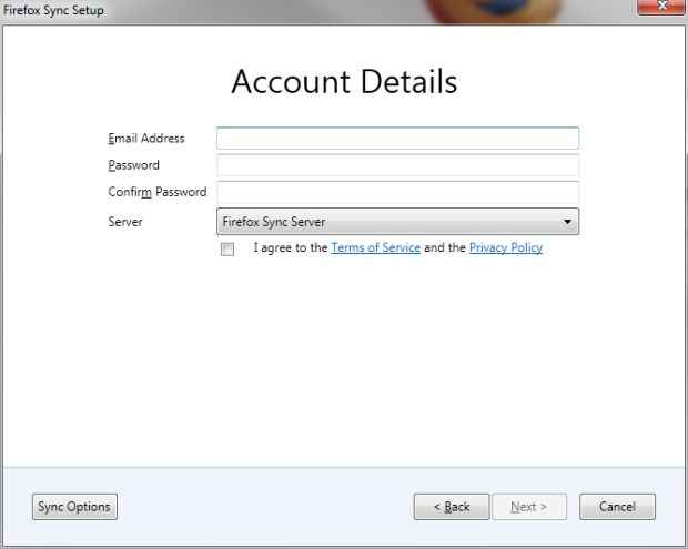
Firefox Sync new account creation
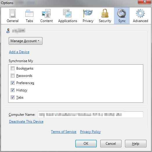
Firefox Sync settings
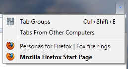 One gripe I have with Firefox Sync is its poor Tab synchronization implementation. While the tabs sync just fine, the only way to access tabs from another device is from the rather light dropdown on the right-most of your tab strip, or to use the History menu — which if you recall is no longer displayed by default. This then takes you to a page from where once can search tabs opened on other computers and click on them to open them here. In this sense iti is a glorified bookmark sync. I expected better integration on the Firefox home page, perhaps even the ability to restore remote sessions. Or at least access to tabs directly from History in Firefox menu.
Panorama
Firefox Panorama, or Tab Groups is one of Firefox's features that sets is apart from all others. Panorama introduces an entirely new way of managing tabs that is comparable to the concept of workspaces / Virtual desktops on Linux.
Essentially, you can divide your tabs into multiple groups based on whatever parameter you want — usually it is important that they are all related to the same task. This is accomplished through a rich graphical UI that shows an overview of opened tabs. One can click and drag in a free area to create a new group, and can visually drag and drop tabs into a group. Groups can also be named, in which case it is possible to right click a tab and use the menu options to move it to a different group.
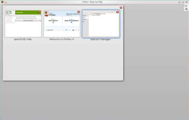
Firefox was already quite good at handling tabs even in the hundreds, but this feature takes it to another level!.
When you have a particular tab group active, you will only see tabs from that group, the rest will be hidden away. This makes it easy to manage with hundreds of tabs where you focus on only a few at a time. Once you activate Panorama, You can also start typing the title of a tab to highlight matches and you can open a matched tab by simply pressing enter.
While Tab Groups / Panorama is a brilliant concept, the idiom "out of sight, out of mind" seems appropriate here. Mozilla has not given enough indication in the browser UI of where there are other tabs in other groups, and no listing of groups outside of Panorama is available. Furthermore Panorama is window-specific, and doesn't allow you to organize your tabs access windows. It would be great if one could move entire groups to a new window or from one window to another. After using the browser for quite a while I once found myself with Firefox eating up too much memory, and on checking realised that I has nearly 40 tabs opened in hidden groups!
Firefox requires you to manage groups yourself, and there is no way to have websites automatically fill into groups. Additionally the default shortcut key for Panorama is Ctrl Shift E which is a rather annoying combo to be pressing frequently, and there is no way to change it.
App Tabs

Firefox 4.0 AppTabs on Linux. Twitter has updates
We might as well have listed these under UI improvements, as currently App Tabs provide few features. This feature is pretty much the same as pinned tabs on Chrome and Opera, in that they allow set certain websites apart, which are then collapsed to the left side of the tab bar.
The tabs collapse to showing just the icon of the website, thus saving space in the titlebar.
App Tabs are useful for tabs that aren't transient, but those you generally keep opened all the time. Earlier you would be bound to lose such tabs amidst other less important tabs.Creating App Tabs is as simple as right clicking a tab and selecting "Pin as App Tab".
Other than their appearance, App Tabs are treated a little differently than normal tabs. For one, they cannot be accidentally closed using keyboard shortcuts for closing tabs. App Tabs do not participate in Tab Groups, instead they are a part of all groups as they remain even as you switch groups.
App Tabs will also glow when there is new content in the page, so you can get an indication when there is new mail in Gmail, or new tweets in Twitter. Any links you open from App Tabs will open in a normal tab instead of changing the location of the App Tab. Finally, App Tabs are restored at startup whether you restore your session or not.
Restartless add-ons
As other browsers have caught up support for Add-ons, they have been able to provide restart-less experience while installing add-ons.
Firefox add-ons can range from small hacks that turn a feature on or off to those that completely change the browsing experience, and here is where Firefox still has a huge lead. As other browsers are adding API's that reach deeper and deeper into the browser, Firefox is completely laid bare, with nearly everything open to change.
Such extensibility comes at a price though, as touching that deep into the browser and changing something isn't easy to do while the application is still running. However, a majority of add-ons don't need, nor take advantage of such access.
Just as Firefox made it possible to install lightweight themes, or Personas, without requiring a restart of the browser, now Firefox has made it possible for Firefox add-on developers to develop add-ons in a way that they can be installed without a restart.
Some add-ons will still require a restart, especially add-ons such as Greasemonkey, NoScript etc. however numerous others can be made restart-less, and it is only a matter of time before even the more complex add-ons take advantage of this feature. Mozilla now marks add-ons that are restart-less with a "No restart required" tag so such addons are easy to identify on the site.
Mozilla is also developing an SDK for creating Firefox extensions, which is much easier to learn since it uses web standard technologies such as JavaScript, HTML and CSS rather than messing about with XUL. Add-ons created using this SDK are restart-less by default.
Some smaller new features
It is often some of the smaller features that end up saving more of your time. For example, how many times have you downloaded a small file using Firefox's download manager and then spent time looking for it in your download? Firefox 4 has a solution to this problem. Now you can simply drag and drop files from the download anager to anyplace on the desktop, a folder or even other application windows.
- Tab switching from location bar — When you start typing in the location bar, Firefox now allows you to switch to existing tabs that match your entry. For example, if you open Facebook once, and then after using the browser a while you forget you already have it open, Firefox will indicate that Facebook is already open, and will let you switch to it.
- Scroll through Tabs — Firefox doesn't keep decreasing the size to tabs till they collapse into near-nothingness like Google Chrome does, instead it lets you scroll horizontally through tabs. Of course this can get annoying if you have a few dozen tabs and have to press a button to move through tabs. Firefox 4 lets you use your mouse's scroll feature to quickly move through the list of tabs.
- WebConsole — well I'm reluctant to call this a small feature, but it is limited impact on those who don't want to get a look at what's going on under the hood. The WebConsole is a developer tool
- Paste and Go, Search and Go — if you copy a URL or search phrase, in older versions of Firefox, you would have to first paste the URL in the location bar or the search term in the search bar and then pres enter to execute the action. Since it is quite likely that one will want to open a URL after pasting it in the location bar, or search for somethign you paste in the search box, these new options can be quite useful.
- Do not Track — Firefox now includes an option that lets you opt out of being tracked by websites. However this feature is of limited use until it is respected by such parties.
- Multi-touch support — If you're one of the few using Windows 7 with a multi-touch input device, you will now be able to use gestures with Firefox.
The Engine behind it all
Firefox 4 brings the second version of the Gecko 2.0 engine that powers the Firefox web experience.
Firefox 3.5 introduced the all new TraceMonkey JIT engine that boosted the speed for some kinds of JavaScript code segments by huge amounts. Unfortunately, when it didn't work, the execution of JavaScript fell back to a much slower method. In Firefox 4 Mozilla introduces the new JägerMonkey engine — with a name annoying enough we have to copy paste it every time — that uses a method JIT instead of a tracing JIT. So now Firefox either goes ultra fast with the TraceMonkey, or super fast with JägerMonkey. The result, Firefox has a huge boost in JavaScript performance.
This, however is not the only performance bump that comes with Firefox 4. It also features hardware acceleration. This means Firefox 4 will take advantage of your graphics card if you have a supported card and drivers. On Windows Firefox uses Direct2D and Direct3D on Windows to accelerate web content. On Mac it uses OpenGL. Linux users are mostly left out due to problems with drivers on Linux. However hardware acceleration seems to be enabled on Linux for machines that have supported hardware and drivers (currently NVIDIA cards with proprietary drivers).
Other than performance, Firefox 4 brings the browser up to date on the latest web standards:
- HTML5 Parser — Firefox 4 includes the new HTML5 parser, which is an important part of the web standard. It allows, among other things, support for SVG embedded in HTML.
- Audio API — Firefox 4 adds support for a curently non-standard (but proposed) API for accessing and manipulating RAW audio data, making it possible for the future of the web to include HTML-based audio editing tools.
- HTML5 forms — Firefox supports many of the new form elements added in the HTML5 specification
- WebM video — Google's new open specification video format for the web is supported in Firefox with this version
- CSS3 — Some great new features such as box-shadows, border radius, transitiona dn transformations are supported with Firefox 4 allowing one to experience a richer, animated web built on web standards — and without JavaScript.
- Web Fonts — Web fonts are very important for proper typography on the web, and Firefox supports this standard with support for WOFF, TrueType and OpenType fonts
- Geolocation — Firefox 4 supports this new standard feature that will allow websites to access your location information with you permission.
In Conclusion
Firefox has made up for its lag behind other browsers since Firefox 3.6, and in many ways excelled them with this release. For power-browsers who need to have may tabs open at the same time, Firefox is an obvious choice. So is it for those who need ultimate customizability in terms of add-ons and themes.
No other browser gets close when it comes to how much Firefox can be customized. In a few easy steps you can make it look like Firefox 3.6 again, if you really believe that UI was better. Firefox now allows more customizability in the tab-bars and toolbars than ever, and the following image will show you just how far you can go:

Firefox 4.0 minimal chrome <30 pixels!
Firefox 4 is not without its shortcomings though, some I have mentioned through the review. Some of the features still feel incomplete, even if they were designed to be like this. Panorama useful as it is, doesn't feel like a full part of the browser, and neither does Sync.
Don't get us wrong, both features work very well, it is just that they could have been improved in many subtle ways. Hopefully with Firefox's new fast release cycle we will see these improvements come sooner rather than later.
In fact while we found that developers have already created add-ons that counter some of these flaws, such as a way to customize Panorama's shortcut, and clearer access to Panorama groups, but these solutions still have to come from within considering that there are only so many add-ons you can install before you start impacting the performance of the browser.
Firefox 4 is a serious contender in this latest generation of browser wars, and one of the best browsers on this generation. Mozilla has worked hard to bring it to its current place as the second most popular browser in the World, and we don't see it slipping just yet.
[ad_2]
Source link

Post a Comment