Nokia’s journey back in to the thick of things in the Indian smartphone market were marked primarily with mid-rangers and budget offerings. And the Nokia 7.2 leads the charge this year. The smartphone encompasses everything that Nokia wants users to enjoy — A seamless, premium design, a clean Android interface and regular updates. But is that enough to last long in such a competitive market? Let’s find out —
Performance
The Nokia 7.2 competes with the likes of the Redmi Note 8 Pro, Realme 5 Pro and the likes. Most of these best-selling mid-rangers now bring in segment-defining features like a Snapdragon 7-series SoC, lots of RAM and storage, HDR displays and what not. The Nokia 7.2 keeps it simple. There’s a Snapdragon 660 under the hood that powers an Android 9-based stock Android interface. Lacking a lot of features common among mid-rangers, the chipset is capable enough to run the software without much of a hitch. But going forward, the phone may feel sluggish as apps and games become more resource intensive. My fears were confirmed by the benchmark scores and how they compared with scores of the best sellers. You can see them below —
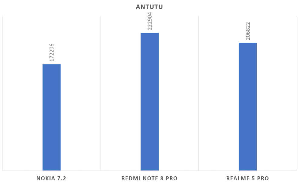
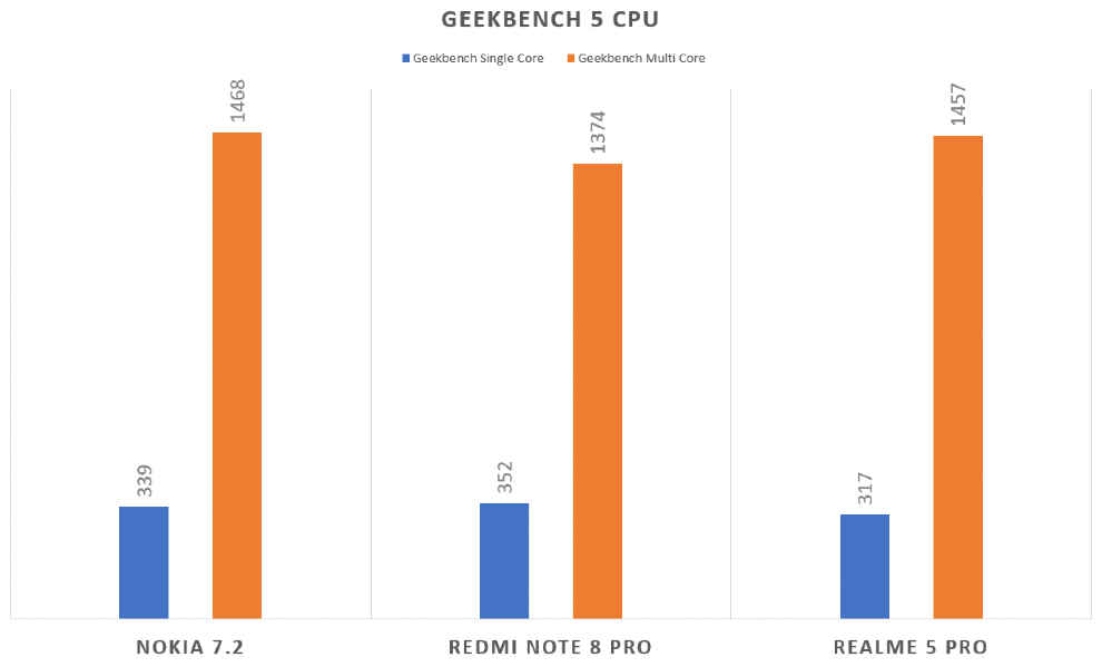
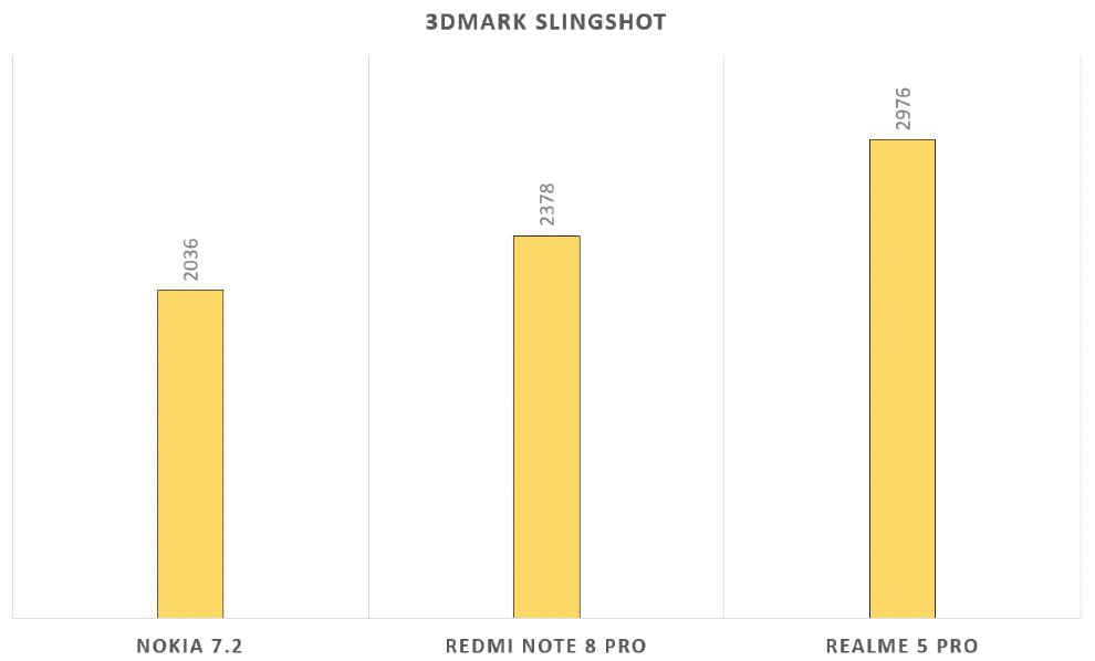
On AnTuTu, the Nokia 7.2 was comparable only to smartphones that launched in the first half of 2019. By the second half, with phones like the Redmi Note 8 Pro and the Realme 5 Pro coming in, the Nokia 7.2 couldn’t match up to the performance. Still, the Geekbench scores are actually quite impressive considering it takes on a smartphone powered by the Snapdragon 712 and the MediaTek Helio P90. The 3DMark score, however, is still quite low.
But benchmarks only tell part of the story. Despite an older processor, you won’t really get any problems using the smartphone as a daily driver. The pure, stock Android interface ensures that there’s no lag while operating the UI. But apps do take a significant amount of time to open, especially the most popular ones like Facebook and Instagram. Games like PUBG Mobile also took more than a minute to get to the main menu. So clearly this isn’t the fastest smartphone in the segment, but it’s simple to use. I’ll give it that.
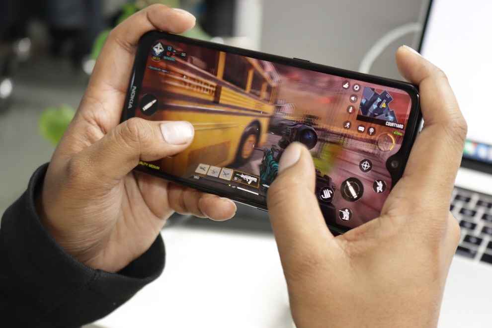
I did try out a few games on the Nokia 7.2 to see how the frame rates and stability numbers match up to the competition. On Call of Duty: Mobile, the Nokia 7.2 delivered 60 FPS at 84% stability, while PUBG Mobile ran at 30 FPS at 97% stability and Asphalt 9 delivered at 30 FPS at 89% stability. The gaming stats were a revelation after the lacklustre performance on benchmark results. The Nokia 7.2 proved to be quite capable as a gaming device despite lacking a dedicated gaming mode and all the bell and whistles other mid-rangers tout as gaming enhancements. Even though we didn’t get the best quality of graphics and the loading times were often too long, there weren’t a single drop in the frame once you were in the map, playing. That’s what counts in the end, and there’s what the Nokia 7.2 delivers without a hitch.
Software
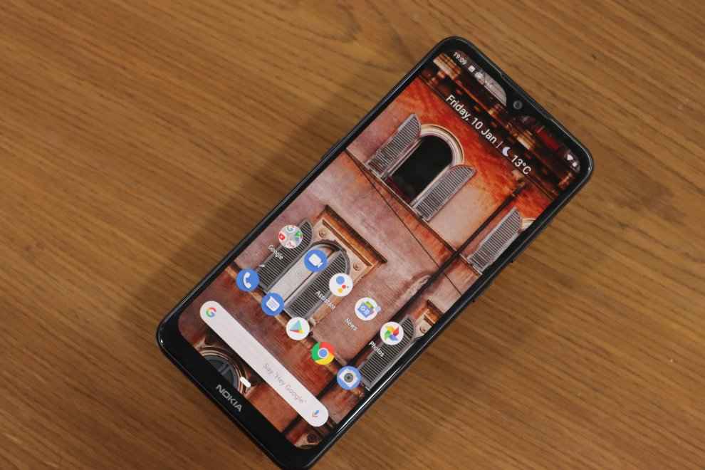
The good thing about the Nokia 7.2 is that no matter what other stock Android smartphone you’re coming from, you’ll feel right at home. In fact, even if you are coming from a Xiaomi or a Realme smartphone, the UI is quite intuitive and easy to use. Not much of a learning curve there. There’s an app drawer that surfaces relevant apps on top giving you quick access, and as much as what critics say, gestures on Android 9 isn’t all that bad. It takes a little time to get used to the pill-shaped home button at first, and the two-step process to access the app drawer is definitely annoying, but it wasn’t a deal breaker.
The Nokia 7.2 is also a showcase of all of Google’s additions to Android 9, and going forward, it will also get the native features of Android 10 including live captioning, dark mode and more. So if you are looking for enhanced features that are popular in Realme and Xiaomi smartphones, this isn’t the one to get. While using the smartphone as a daily driver, I realised this is an excellent option for those who just needs the basics. Not much bloatware with the Google ecosystem of apps dominating your usage, and a clean interface that doesn’t distract you from the work at hand.
Battery Life
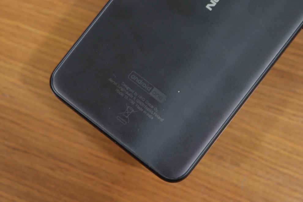
The Nokia 7.2 comes with a 3500mAh battery inside that charges using a regular 10W charger. The charging speed is definitely an issue as I had to keep the phone tethered to the cable for more than two hours to top it up. No fast charging here. But the battery, thanks to all the power optimisations Android 10 brings to the table, easily lasts a day. I used it during events to take photos and videos, send and receive messages across multiple apps, and played a few games, and by the evening, there was still around 20 percent charge left. That’s just about decent compared to the rest.
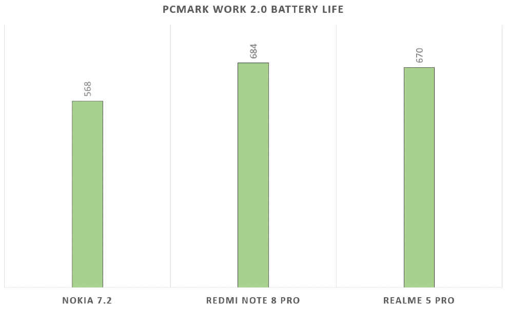
In our tests for battery life, the Nokia 7.2 lasted 568 minutes running PCMark Work 2.0 Battery Test, which converts to screen-on time of around nine hours which is pretty decent. 15 minutes of PUBG Mobile drained the battery by around 4 percent while 30 minutes of Big Bang Theory on Netflix drained around 6 percent charge.
Camera
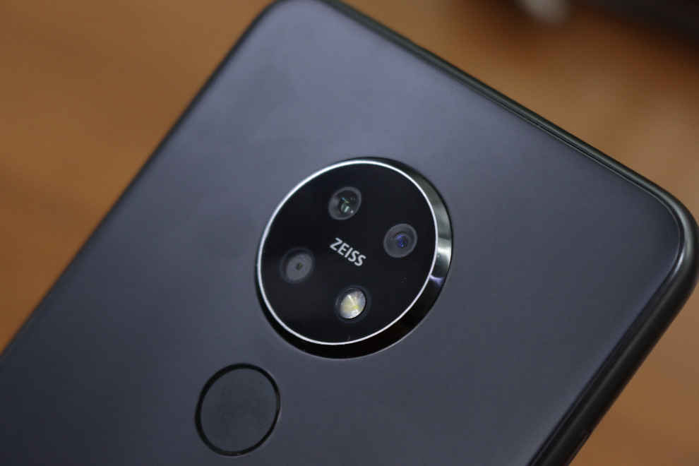
After the penta-camera setup on the Nokia 9 PureView, the Nokia 7.2 brings a triple camera setup. No, the camera setup are nowhere related but HMD has continued working with Zeiss optics to develop the camera. On the Nokia 7.2, you get a 48MP primary sensor with f/1.8 aperture, along with an 8MP ultrawide sensor and another 5MP depth sensor. So technically, only two out of the three lenses are used for shooting. The third is to capture depth information for photos. Nokia uses the Pro camera app on this, where you can access more or less all the options by just fiddling around with the shutter button. Swipe up to access pro controls and swipe left or right to cycle between portrait, night, and video modes. Switching between lenses is also easy as the option is right above the shutter button while the top shelf is sprinkled with additional options that may not look all that aesthetic, but I found it quite useful.
Here’s how the camera performed —
Daylight

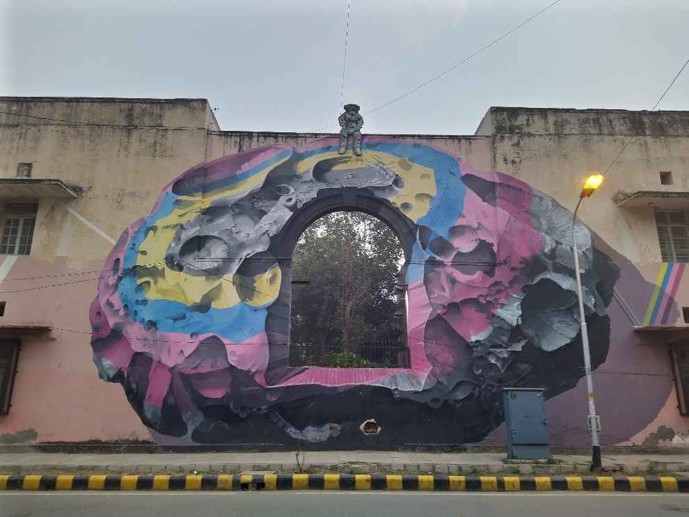
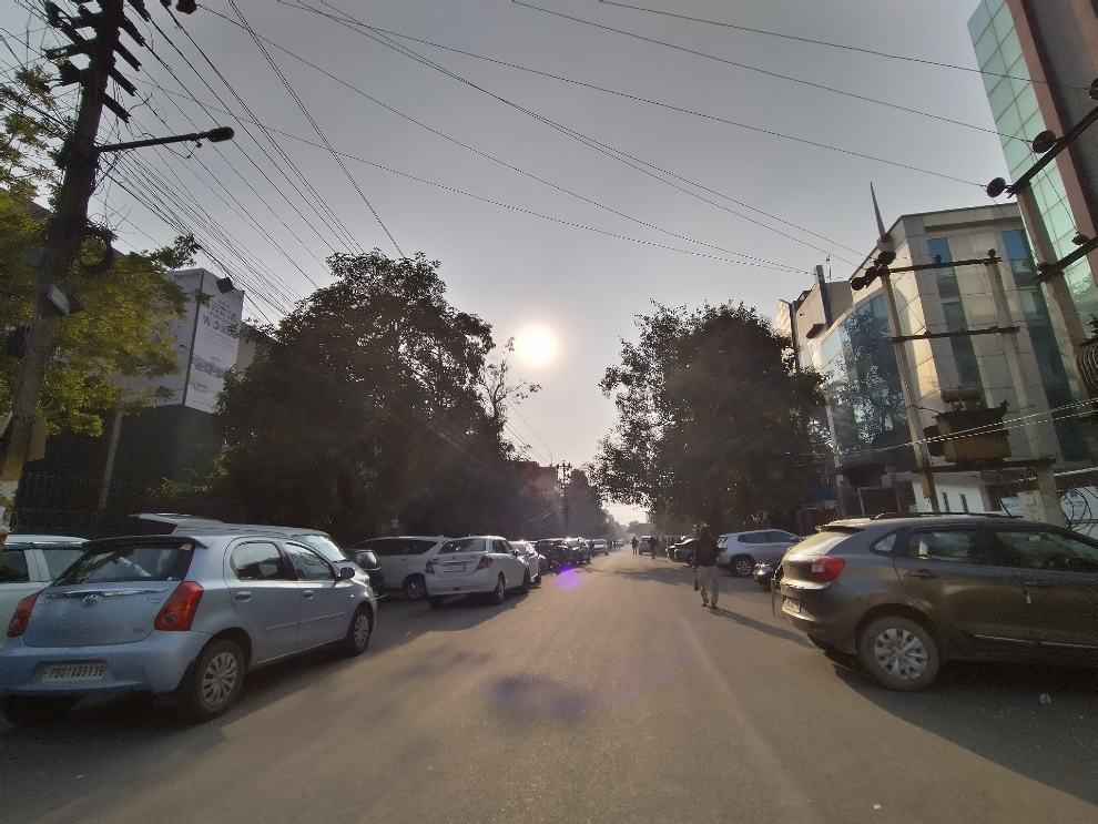

The primary 48MP camera is quite good at capturing photos in the day, provided there is ample light. The AI scene recognition kicks in near-instantly and you can see the phone applying the additional settings in real time through the view finder. I especially liked the HDR capabilities of the camera. Shooting under the direct sun should have darkened the shadows on most other mid-range smartphone, but the Nokia 7.2 manages to eke out a lot of details from the shadows, even from the ultrawide lens. The Nokia 7.2 also doesn’t apply too much saturation and contrast to the photos, and the colours come out a lot more natural than others. Now this might not sit well with users who are used to boosted colours that most AI algorithms tend to do. The camera is also quite capable in reproducing textures as you can see in the photo of the pup.
Low light

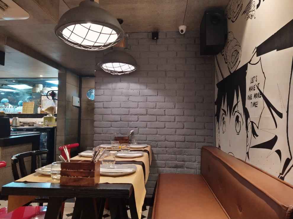
Under low light, the Nokia 7.2’s camera performance degrades significantly. That used to be the case before with most smartphones but offerings from Realme and Redmi really set a benchmark in low-light photography this year, and the Nokia 7.2 struggles to compete with it. You can see from the two photos above how the details are muddied. We used the night mode to take the photos (which also takes a good 4-5 seconds to take the shot), and while it got the brightness and colours mostly right, the details and sharpness are missing.
Portraits and Selfies
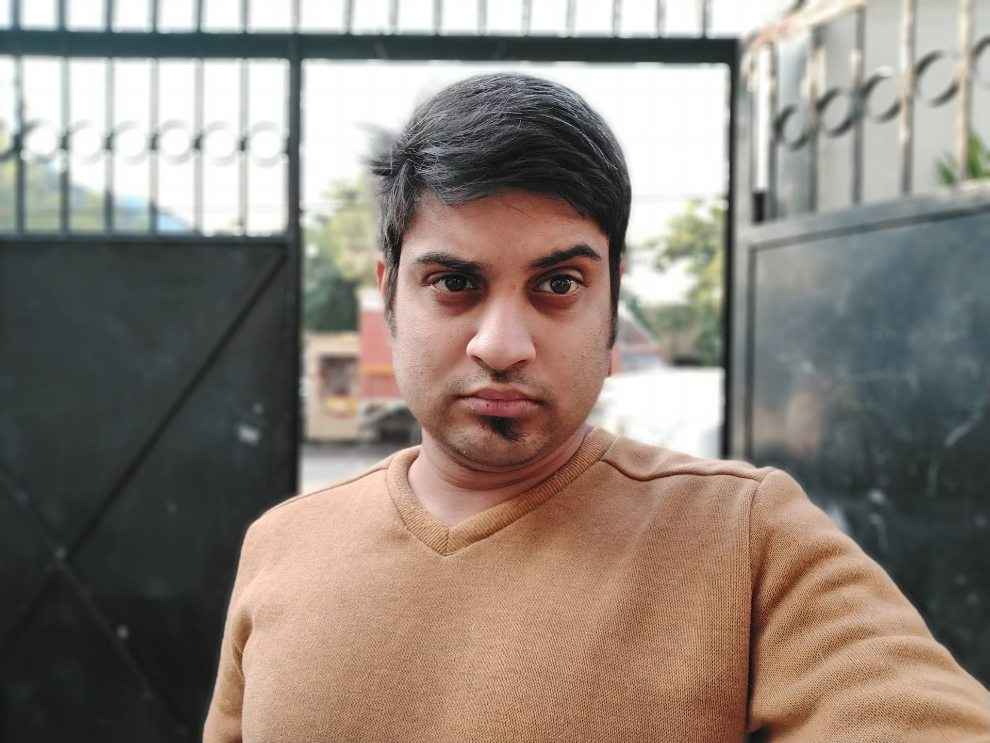
Portrait mode and selfies come out quite well. The background blur does look a little artificial and there are parts of the hair that got blurred out, but overall, the details and the sharpness on point.
Design and Display
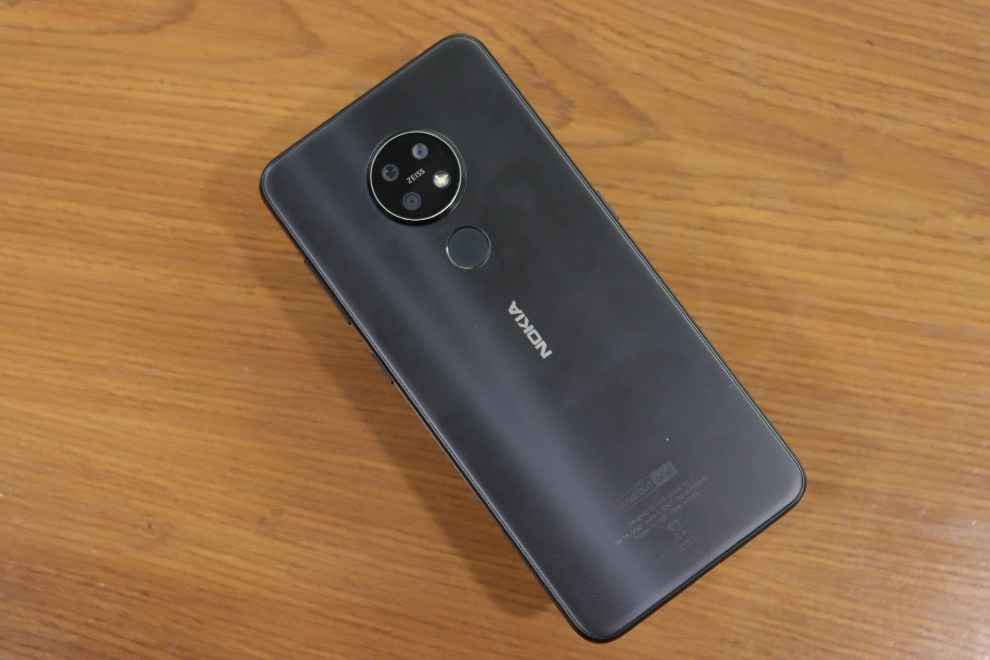
The Nokia 7.2 is exquisitely crafted. HMD used a new technique to mill this using polycarbonate, but I bet you wouldn’t even realise it’s plastic. We received the Charcoal Black variant of the device, and there was a murmur of appreciation right after it came out of the box. Despite using plastic and sporting a giant, protruding camera bump, the Nokia 7.2 looks well-crafted and stands out from the rest of the lot. Most polycarbonate smartphones these days look cheap, but the Nokia 7.2 isn’t one of those. Instead, you get a breathing power button that alerts you when there’s a pending notification, a USB-C port and rounded corners. The phone is also quite easy to hold and use. It’s not slippery and it’s not a fingerprint magnet. But from the front, the Nokia 7.2 now looks quite old-school. There is a rather big drop notch along with a thick chin with the Nokia logo engraved on it. The company could have done away with the logo placement and extended the panel a little more on the bottom. There’s a single speaker at the bottom and a 3.5mm headphone jack on top.
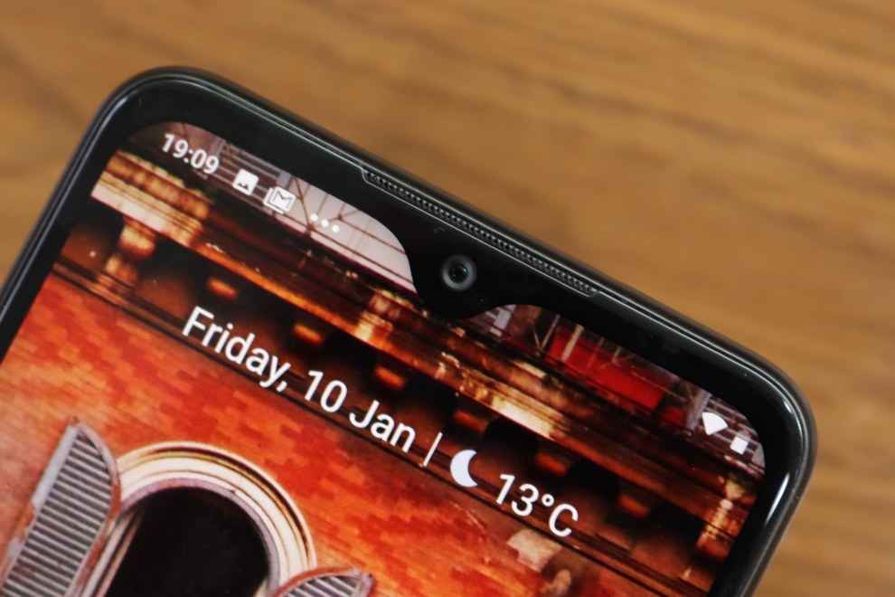
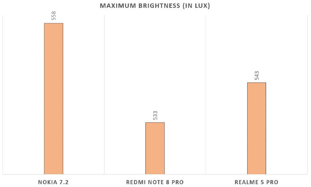
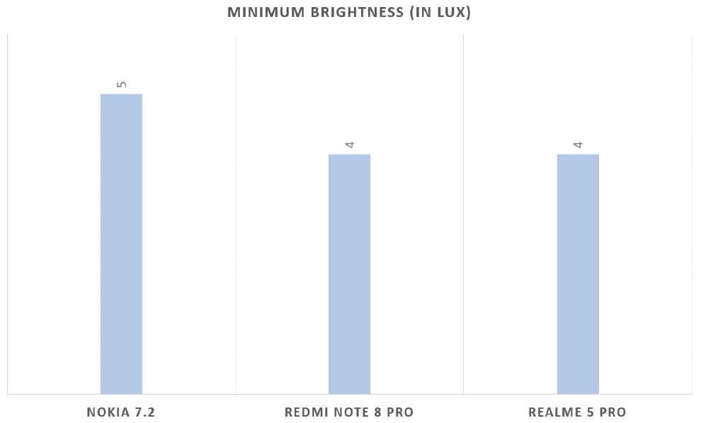
The 6.3-inch display is another good thing about the Nokia 7.2. The LCD panel operates like an OLED panel thanks to Nokia’s Pure Display technology that simply means the panel has a boosted dynamic contrast ratio that makes blacks look blacker despite a backlight lighting the pixels in the LCD screen. Nokia also managed to get an HDR10 certification for the display although we are not sure whether this is a 10-bit panel in the first place. Despite HDR certification, content from Amazon and Netflix don’t play in HDR. You can only watch HDR videos on YouTube. The phone also houses a dedicated chip to convert SDR videos to HDR but I didn’t see a big difference in videos or games. Nevertheless, the 6.3-inch LCD display went up to 558 lux in maximum brightness under the sun, and went down to 5 lux in minimum brightness in the dark.
Bottomline
The Nokia 7.2 may not look all that powerful, but it’s a delight to use. The Snapdragon 660 is perfectly capable of handling the lightweight stock Android interface, offering reliable performance in handling the usual daily tasks, as well as during gaming. The camera is the dark horse, delivering consistently good results provided the subject is well-lit. Low-light images is a weakness however. The Nokia 7.2 also is one of the best looking smartphones in its segment, despite having a polycarbonate body and a rather big camera bump.
[ad_2]
Source link

Post a Comment