Samsung Galaxy S9 detailed review
The Samsung Galaxy S9 is a follow-up to last year’s Galaxy S8, but looking at the phone, you wouldn’t be able to tell them apart. The Galaxy S8’s design was not only functional and ergonomic but it also looked stunning too. No need to fix that which isn't broken. While that’s definitely a good thing, the Galaxy S9 comes across more like an ‘S’ variant of the Galaxy S8, much like how Apple uses the term to define minor upgrades to its iPhone lineup. There are definitely some welcome upgrades, especially in making biometric authentication easier and faster, and a whole new approach to low-light photos, apart from tiny, but meaningful additions.
Between the Samsung Galaxy S9 and the S9+ this time, the difference is not just the battery and the display size. Now there are two cameras at the back of the elder sibling. But being a stickler for compact devices, the smaller Galaxy S9 feels way more ergonomic and easier to use than the bigger variant. The smaller form factor makes it easier to grip the phone and allow for one-handed use.
However, all that is also pertinent for the older Galaxy S8, so is there a justification to upgrade to the newer and more expensive Galaxy S9 instead of the S8? We find out.
Design
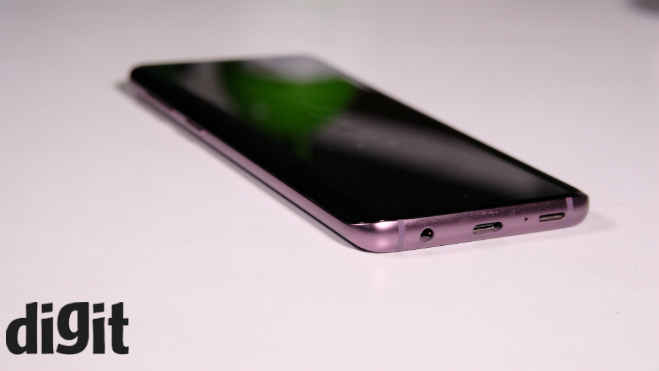
Place the Galaxy S9 and the Galaxy S8 side-by-side and you will not be able to tell them apart. At least from the front. While every other OEM has gracefully embraced the notch, the Galaxy S9 boldly stands out as a full-screen device without ugly cutouts in the display. Instead, Samsung maintains small, but prominent forehead and chins on the front while the display curves around the edges to blend in with the rest of the body. This design philosophy is more preferable over the Notch as the screen is uninterrupted and there’s some space to grip the phone when held horizontally.
Everything that was good with the Galaxy S8 has been carried over to the Galaxy S9, with minor refinements. The bezels are just a little more thinner and about two millimeters have been shaved off in height, making the phone feel even more compact without messing with the 5.8-inch display size. The Infinity display takes up most of the surface and curves down the edges to meet the metal frame, and it looks just as stunning as the Galaxy S8, if not a little aged. Samsung also introduced a lilac purple colour variant of the Galaxy S9 which we received for the review and the glass panel at the back makes it stands out from the crop of metal unibody phones.

You’ll know things have changed when you turn the phone around. The placement of the fingerprint sensor on the Galaxy S8 was universally hated, so Samsung moved it around. It is now just below the camera lens, where your finger is very likely to miss the sensor again. Thankfully, it is much easier to reach than last year's fingerprint sensor.
Holding the Galaxy S9, it feels like Samsung put every bit of effort to make this a premium smartphone.You’ll know where your money went when you cradle this phone in your hands.
Display
The 5.8-inch Infinity display is the center of attraction of the Galaxy S9. It looks a lot like the one on the Galaxy S8 with the Super AMOLED panel sort of melting into the metal frame along the edges. The QHD+ resolution also remains the same. Being a Super AMOLED display, the black levels are deep with a high contrast ratio. The default display calibration isn’t as oversaturated as on the Galaxy S8 though. Samsung seems to have worked on making this one of the more colour accurate panels. However, if you’re not happy with the colour temperature, you can tweak it in the display settings.
The display is Mobile HDR Premium compliant and also Daydream-ready. I particularly liked the Adaptive display setting which tweaks the colour temperature and brightness based on the ambient light, much like what Apple does with its TrueTone display.
All that was said about the display on the bigger S9+ stands true for the smaller sibling as well. Being more compact, the pixel density on the S9 is much higher at 570 ppi as compared to 529ppi on the S9+. Ideally, that should make the panel on the S9 appear crisper and more vibrant, but it doesn’t make much of a difference here as the AMOLED panel made by Samsung is one of the best out there.
Performance and UI
The Samsung Galaxy S9 and the S9+ has the same set of hardware under the hood — Samsung’s proprietary Exynos 9810 in global markets and the Snapdragon 845 in the US and some other regions. Both chipsets are manufactured on a 10nm process and houses an octa-core processor. The Exynos chipset can hit a max clock speed of 2.7GHz, coupled with an 18-core Mali-G72 GPU. All that should make the Galaxy S9 one of the fastest device around. But it would be hard to eke out that level of performance from the chipset.
We ran the AnTuTu Stress Test with Qualcomm’s Trepn Profiler running simultaneously to note the CPU frequency that the chipset clocks when handling different workloads. Turns out, the CPU hardly went above 1.79GHz and only when the load on the CPU and the cores were at 100 percent did the performance cores hit the max clock speed. That too after quite sometime of sustained load on the chipset.
Most of the times, the Exynos 9810 chipset will not go above the 1.79GHz mark which is the base clock speed of the high-performance M3 cores. Only when the CPU is stressed for a particularly long time will the chipset hit the advertised max clock speed. But that’s not essentially a bad thing. Samsung is actually giving itself some headroom should there be a need for the extra power.
Then again, the Galaxy S9 does have a tendency to heat up a lot. I even got a prompt about the phone overheating and shutting down apps in the next 20 seconds. Samsung hasn’t used a heat pipe in the device and the glass back offers no means for the heat to dissipate.
Benchmark reports peg the Galaxy S9 higher than all other flagships from last year, although it wasn’t at par with the S9+. 3DMark Slingshot gave a score of 3801 as compared to 3884 on the S9+ while on AnTuTu the difference was of 40,000 points. That’s an unusually high difference and we are probing it further. Geekbench’s single core performance between the two was similar, but the multi-core performance was less by about 900 points (which again is alarmingly high).
Samsung’s UI isn’t helping either. Yes, it has improved vastly over the older versions. It even has a new name now — Samsung Experience. It’s more optimised but still takes up a lot of memory even when idle. While the bigger S9+ has extra 2GB of RAM to compensate for it, the smaller sibling sometimes slows down and stutters a bit, but quickly gets back on its feet. Using the phone as a daily driver, I often found around 25 percent RAM left free, which is never a good thing when the going gets tough. The battery drop when idle is also around 4-5 percent over a period of 4-5 hours. That’s much higher than what phones with stock Android offer.
The real-world performance of the phone, however, was quite flawless. Apps open soon as you tap on them and switching between two memory-intensive apps doesn’t take much time. There are also no lags in performing basic operations while gaming will be more or less without a hitch.
There’s reason for the UI to be memory-intensive though. Samsung offers a plethora of features that are unique to Galaxy devices, most of which aim to improve productivity. The Edge Panel which makes apps, shortcuts and contacts easy to access by just swiping from the edge is really useful while the Samsung’s windowed mode can make any app appear in picture-in-picture mode. Finer things like the Samsung Health app that allows users to keep track of important factors like heart rate and sp02 levels, while the settings menu allows just about every aspect of the phone to be customised.
Samsung has also beefed up its security features with the S9. The Iris scanning is now combined with facial recognition to make it more reliable. Biometrics is needed to access the secure folder and in place of passwords.
Introduced in the Samsung Galaxy S9 are the new AR emojis — animated avatar resembling your appearance which can be shared in the form of GIFs while messaging. It doesn’t work as well as its iOS counterpart, but the varied expressions can be entertaining for the first few times you use it.
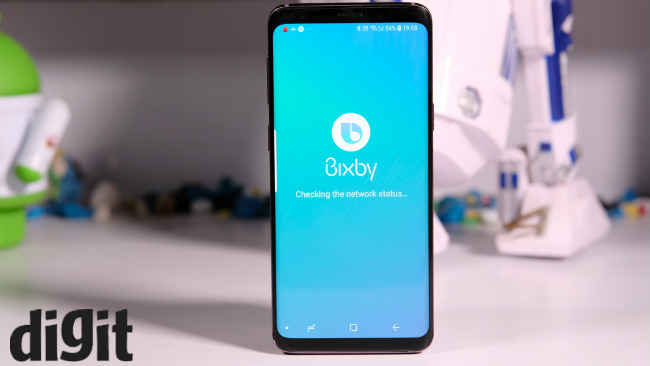
And then there’s Bixby. Samsung’s voice-based AI-assistant once again gets a dedicated hardware button and is still quite half-baked. However, Samsung has promised a Bixby 2.0 later this year, which will open the platform up to third-party developers and will be more integrated with IoT devices. Currently, Bixby can run basic commands like opening apps, sending messages and calling people. It can also leverage the camera to allow users to perform visual searches and translate in real time.

The Samsung Experience UI is pretty much the same in both the Galaxy S9+ and the S9. Most of the features (save for the AR emojis) are now available in the Galaxy S8 as well as the Galaxy Note 8. If Samsung’s UI is why you’re looking to upgrade, it’s better to stick to the older models.
Camera
The Samsung Galaxy S9’s design and display are not new. There’s simply no difference in the way the phone looks and feels as compared to its predecessor. So why will you be interested in it? Well, Samsung wants you to buy this phone because of the innovation it has made in the camera by putting a dual aperture mechanism on the rear camera. The S9 rocks a 12-megapixel 26mm camera with dual-pixel autofocus, optical image stabilisation and single LED flash. The camera sensor is 1/2.5-inch which is the standard size in smartphones, while the pixel pitch is 1.4um. What’s interesting is that the camera can switch between f/1.5 and f/2.4 depending on the amount of ambient light.

But here’s the thing. In a time when even mid-range smartphones are shipping with apertures as wide as f/2.0, why would Samsung want to put a tiny f/2.4 aperture? That small an aperture, especially with a tiny 1/2.5-inch sensor will have no use whatsoever in improving the imaging prowess. Ideally, smaller apertures are used to make the photos sharper with tighter exposure and more details. But the sensor size in smartphones will cap the light absorption to a point where the f/2.4 aperture will not make much of a difference.
At day time, photos taken in f/1.5 and f/2.4 apertures have practically no difference whatsoever. The phone is smart enough to adjust the shutter speed and exposure to compensate for the lower aperture while at f/1.5, the same adjustments are made to nullify the extra light. What’s the point of the f/2.4 aperture then? It comes across more of a gimmick, and in marketing terms, putting a tiny aperture makes the f/1.5 aperture (which is the real innovation here) stand out. Furthermore, the LG V30 boasted of the widest aperture till last year at f/1.6. Samsung wanted to go a step further, but that small an improvement could only be highlighted by diverting the attention to the dual aperture, which indeed has never been seen before in a smartphone.


The f/1.5 aperture, on the other hand, puts the S9 ahead of the competition. The wide aperture helps capture a lot more light and the resulting shots are quite well-lit. However, if you compare the photos with those taken with the Galaxy S8 (that had a f/1.7 aperture), the difference is in the light intake. The same noise reduction algorithm is also present in the Galaxy S9 that softens the details and save for the exposure, nothing much has changed here. There’s also Samsung’s signature yellowish tinge in the low-light shots.

Samsung wants you to think the dual aperture technology is a reimagination of the smartphone camera. Surely there have been a lot of engineering effort put in, but that’s doesn’t reflect in the end user’s results. The f/2.4 aperture has no practical advantage whatsoever and in this day and age, Samsung has no right to put that small an aperture in a flagship phone’s camera.
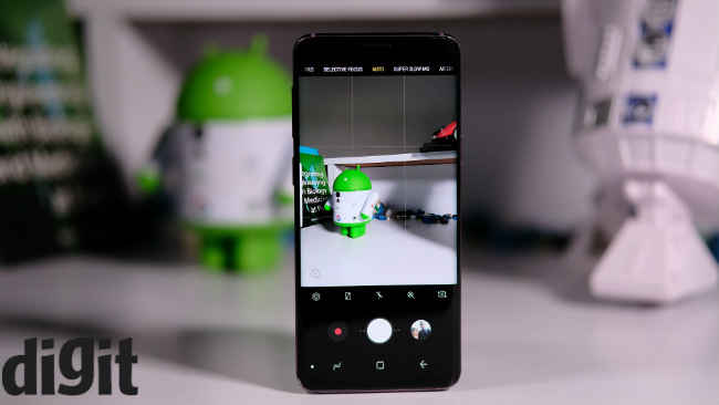
But the dual aperture is not the only thing new in the camera department. The Samsung Galaxy S9 can shoot super slo-mo videos at 960 frames per second. The feature was introduced in the Sony Xperia XZ Premium last year, and Samsung seems to have cracked the formula to do it as well. The tech works by shooting 960 photos per second to slow down motion. The camera stores that many shots in the DRAM chip which is then processed and transferred over to the storage. The phone can give an output of 720p, even when Sony’s new Xperia XZ2 can do the same at 1080p. Once again, this isn’t anything new or innovative but Samsung’s implementation of the tech is better than Sony’s. The phone can detect motion inside a box in the frame to slow it down. It’s much more intuitive, but the fact remains that the feature is pretty much unusable after 5 PM as shooting at 960 fps requires a massive amount of light.
The front camera though, has been mostly left untouched. The same 8-megapixel sensor with f/1.7 aperture and 25mm lens has been carried over from the Galaxy S8 to the S9. Selfies come out well detailed with just the right amount of exposure with the option of applying filters and beauty effects. It’s pretty standard, the implementation of it. There’s a selfie focus mode that can simulate the background blur while a wide selfie can basically take a panorama with the front camera. Both are quite useful and help in augmenting the selfie experience.
Battery
The Samsung Galaxy S9 takes after its predecessor in terms of the battery capacity as well. The phone retains the 3,000mAh battery, but the power-hungry Exynos chipset does not give the same result. As we noted in the performance section, the Exynos chipsets of the Galaxy S9 is hungrier to take power which depletes the battery quicker than its predecessor. The Galaxy S9’s PCMark Work 2.0 battery life performance was around 25 percent lesser than the Galaxy S8. Definitely not a good sign for a future-forward flagship phone. Using the camera and especially shooting slo-mo videos drains the battery a lot quicker, as do performance-intensive games and apps. The new PubG mobile game dropped the battery percentage from 80 to 40 in less than an hour of gameplay.
Having said that, Samsung bundles a fast charger with the phone which fills up the tank in less than an hour and a half. That’s a saving respite considering how the phone fails to last the average work day. I often found myself plugging the phone in after a day out reporting which usually includes doing a live stream, shooting photos, Tweeting, and taking videos, apart from the back and forth messaging with my team at the desk.
A good battery life should be a given when you are splurging half a lakh rupees on a device that is a phone first and then everything else. All the innovation and all the design improvements aside, a dead phone is an useless piece of junk in the pocket.
Bottomline
All things combined, the Samsung Galaxy S9 comes across more of an iteration of last year’s innovation than a step forward towards the future.It’s futuristic design will surely catch the eyes of onlookers but more often than not, it will be mistaken for the older Galaxy S8. The camera too will not make much an impact in making your social media game stronger, and more often than not, you may find yourself red-faced when the phone unexpectedly runs out of power while you’re showing off all the cool features the Galaxy S9 struts.
[ad_2]
Source link

Post a Comment