Pebble Time detailed review
During the review process of the Moto 360 second gen or the LG Watch Urbane, the biggest problem I had was that the smartwatches either died or were about to die towards the end of the day. There were times when the watch was on my wrist and someone asked me the time and I found the watch dead. The only smartwatch that we have come across that has the ability to last a few days has been from the house of Pebble.
Today we have with us the Pebble Time. With a colour e-ink display and a simple design. Could this be your next smart timepiece?
Build and design
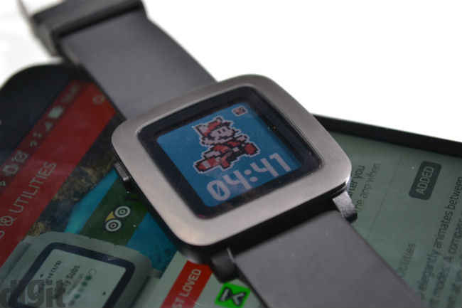
Kicking things off with the design of the Pebble Time, the smartwatch has a simple, elegant design. While a lot of smartwatches like the Moto 360 Second Gen, LG Watch Urbane and the Samsung Gear S2 sport a round design, the Pebble Time has a square design. Sure there is a Pebble Time Round available in the market, but we haven’t managed to get our hands on it yet.
[embed]https://www.youtube.com/watch?v=CE8TyYsWgF4[/embed]
Moving on, you have a Tough 2.5D curved glass protecting the display and it is surrounded by a stainless steel bezel. There have been occasions where I have bumped my regular watch to the sharp edges of a table, rendering the display cracked. The glass protecting the Pebble Time isn’t extremely strong but it does manage to protect the device from such accidents. The display is surrounded by a stainless steel bezel making the design quite sturdy. Surprisingly the thick bezel doesn’t make the display look small.
The Pebble Time weighs 42.5 grams making it relatively light to wear and also feels sturdy at the same time. The Pebble Time is available in three colours – red, white and black and the review unit we received was the black one. The straps can easily be removed in case you want to replace them.
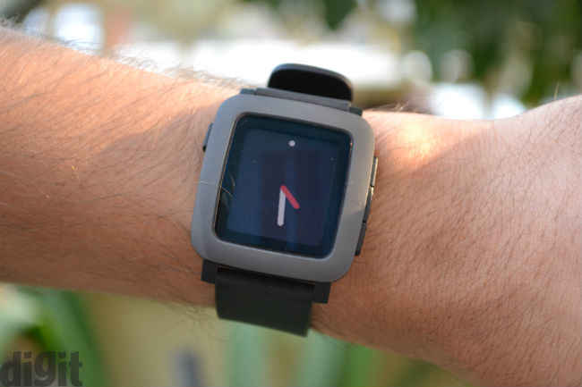
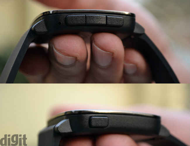
The Pebble Time doesn’t have a touchscreen but has four physical buttons - three on the right and one of the left. The left button is the back button and on the right you have the up, down and action button. Having used a touchscreen smartwatch, using the physical buttons can take some getting used to. The buttons are sturdy and well built and require that you really press them to respond. This isn’t a bad thing, as the buttons won’t get pressed accidentally. Over the course of using the device, I started enjoying the experience of reading mails on the smartwatch by scrolling through them using the buttons. For some reason it felt a lot better than scrolling using a touchscreen. That was of course before we at Digit got our hands on the Samsung Gear S2. The rotating dial on the Gear S2 feels a lot more intuitive and the best navigation experience so far on a smartwatch.
Coming back to the Pebble Time, it is very well built. The black colour option that we received for review looks elegant whether you wear it with formals or casuals. It has a neutral design and won’t turn heads.
Performance and Battery life
Kicking things off with compatibility, the Pebble Time works with Android and iOS and it works really well with both. Simply download the companion Pebble app from the App store or the Play Store and you are good to go. Before we get into the number of things you can do with the watch, let’s get the battery life out of the way. The maximum battery life I got out of the watch was about 5 days. On the lower side it died in three days. The Pebble Time has the best battery life when compared to other smartwatches we have reviewed.
Coming to the performance, there is a lot that you can do with the smartwatch. You have to keep digging to find some really cool apps. There are of course a slew of watch faces and my new personal favourite has to be the 8 bit NES heroes, which changes the NES character each minute. It was fun looking at the NES character on the watch and remembering the good old days of gaming.
The Pebble Time has an interface called the Timeline and overall the UI is very clean and easy to navigate. You can install all the apps you want on the smartwatch through the companion smartphone app and you can also control what apps notifications appear on the watch. Some interesting apps include Uber, Misfit, Tiny Bird (a version of Flappy Birds), Tripadvisor, to name a few. There are also a bunch of games that you can play from the comfort of the watch itself and some of these games are quite addictive.
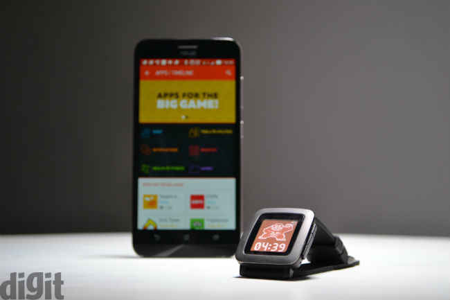
The apps library of the Pebble Time is very large. Compared to Watch OS and Android Wear, the Pebble Time doesn’t have Siri or Google Now voice services and that is a bummer. But you can reply to a WhatsApp message or an SMS from the comfort of the Pebble Time without removing your phone from your pocket. You can reply using emojis, standard preloaded replies or dictate a reply yourself. For the most part the voice recognition works well but there were times when it couldn’t understand my accent. You can forget about the device recognizing Indian names. The only downside here is that not all emojis are recognized and WhatsApp messages sent in Hindi look like boxes on the Pebble Time.
There are a bunch of fitness apps for the device too and there is a built-in Health app as well that tracks your steps and sleep. I wouldn’t trust the accuracy of the app much. One morning I woke up at 7AM, as I had to move my car and came back to bed at 7:15am. When I woke up at 9AM the watch showed that I was up at 7. On the plus side, the app shows you your deep sleep for the night as well. It’s a nice way of tracking your sleep. Just don’t trust it blindly.
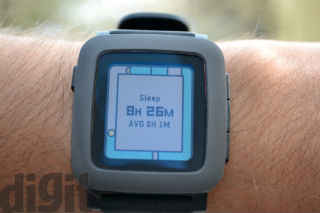
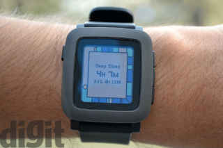
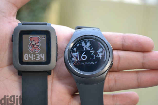
Coming to one of the best features of the watch, the colour e-ink display. Yes it’s a colour e-ink display and the best way to describe it is that it looks a lot like the first colour Gameboy but with a wider colour gamut. The display is always on and is easily visible in sunlight. The fact that it has a display that’s easily visible in the sun and gives you five day battery life is a big deal when compared to other watches. Comparing the display to the Samsung Gear S2, the display on the Pebble Time looks a lot like Mario from the SNES days and the Gear S2’s display looks like Super Mario Galaxy and that isn’t necessarily a bad thing.
Bottom Line
I could not justify the purchase of a smartwatch simply because the battery life on these devices really sucked. The Pebble Time however needs to be charged once in four days, and that is the main reason why you will get hooked to it. Once you are hooked, the deeper you dig, the more functions you will find. During the course of writing this review, I have found a bunch of watch faces I like, a bunch of apps I’d like to explore and reading mails on the watch at night while my phone charges in a corner was a pleasant experience. Sure, there is no dire need to own a smartwatch and the device can be categorized as a luxury gadget but there is some fun to be had, especially since the device won’t die on you. You can last an entire day with just 20% battery if you use the device as a watch only and that’s a very good thing. The Pebble Time is priced at about Rs. 20,000 in India and that is expensive. The display is great for sunlight visibility but isn’t as cool to look at as the Gear S2. The physical buttons are old school and work well with the Pebble Time’s OS but the wheel on the Gear S2 is more intuitive and easier to use. Where the Gear S2 loses out is with the battery life and that’s the only reason I would prefer the Pebble Time. If you are looking for a smartwatch that can last for 5 days, then the Pebble Time is definitely a contender at the top of your list. But if style over battery life is what you are looking for then you are better off looking elsewhere.
[ad_2]
Source link

Post a Comment