Nokia 3.2 detailed review
HMD Global Oy, the current owner of the popular and long-standing Nokia brand, has just launched another smartphone model for the year. The Nokia 3.2, which was first spotted at the Mobile World Congress in February, follows the Nokia 4.2 to the Indian market, which we reviewed earlier this month. At first glance, the Nokia 3.2 appears to be a slightly more affordable model with a larger display and battery. But is that all? Let's dig deeper.
The Nokia 3.2 is powered by a Qualcomm Snapdragon 429 chipset and up to 3GB of RAM. Internal storage is either 16GB or 32GB depending on the variant. The screen is a pretty large 6.26-inch IPS LCD unit with an HD resolution. At 4,000mAh, the battery seems capacious too. The phone is offered in a single colour: Black. According to Nokia, the 2GB RAM + 16GB storage variant currently costs Rs 8,990, and the 3GB RAM + 32GB storage variant, Rs 10,790. Our review unit was the more expensive variant. Let's see how the Nokia 3.2 fared in our review. ABCD
Build and Design
Much like the Nokia 4.2, the Nokia 3.2 features a curved candybar design. But there are two key differences between the two models: while the Nokia 4.2 employs glass on the front and back, the Nokia 3.2 sports a glossy plastic back panel, leaving only the screen to be covered with an unspecified 2.5D curved glass. Nokia does not talk about Corning Gorilla Glass protection in its press release or website. Because of the bigger screen, the phone is a whole lot larger to hold in the hands. In my opinion, that half an inch goes a long way in making the phone feel ungainly for one-handed use.
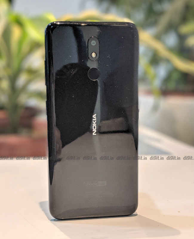
Sorry about the lint, the back plastic panel is a magnet for smudges and fingerprints
Though the Nokia 3.2's back panel is made of hollow-sounding plastic, it gives the phone sufficient class, especially in that glossy black colour. You should be able to hold this phone up with confidence in front of your mates in college. Expectedly, the panels on the front and back invite fingerprints and smudges as much as an open casserole invites ants. The back panel is also prone to a bit of flex especially when gripped too hard. Like its bigger brother (and pretty much every budget smartphone out there now), the Nokia 3.2 gets a screen with rounded corners and a tiny U-shaped notch at the top (for the you-know-what).
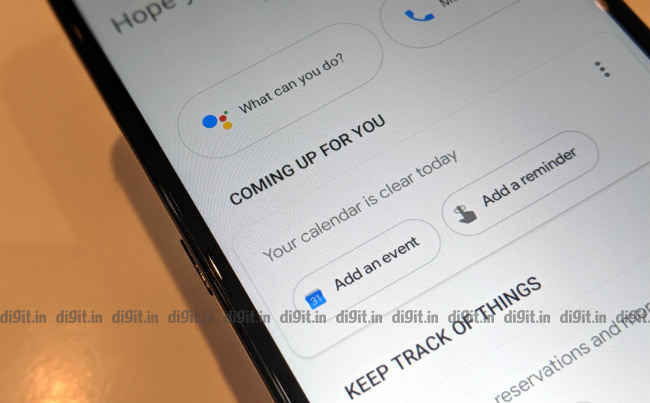
Dedicated Google Assistant key on left side
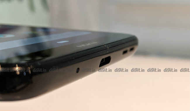
The sides of the phone’s body are quite busy: the top side gets a 3.5mm audio jack and a secondary microphone. The bottom side sees the primary microphone, a single loudspeaker grille, and a microUSB port (for charging and data transfer). The right side houses the volume rocker and power button, the latter of which doubles as a notification light and charging indicator in dim white. Both buttons have a nice, tactile feel. The left side of the phone’s body gets a dedicated Google Assistant key. Pressing it fires up Google’s popular digital assistant in “ask” mode. Power users will be disappointed to know that the button can’t be reprogrammed in Settings to launch other apps, like Instagram or WhatsApp. In summary, the Nokia 3.2 is quite decently built and designed for its price.
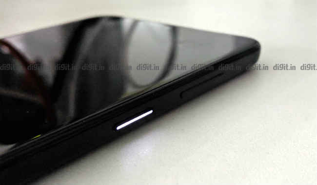
Glows steadily while charging
Display and Audio
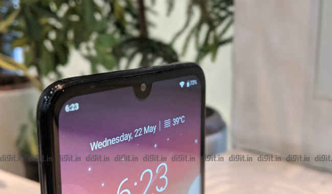
As if it were the long lost twin sister of the recently launched Xiaomi Redmi 7, the Nokia 3.2 sports the same sort of display as its Chinese competitor. The Nokia 3.2 comes with a 6.26-inch a-Si TFT LCD panel with an aspect ratio of 19:9 and a resolution of 720 x 1520 pixels. Its pixel density is a decent 269 pixels per inch. In comparison, the Nokia 4.2 comes with a much smaller 5.71-inch LCD. The Nokia 3.2’s “selfie notch” does not permit some apps to fill the entire screen but it’s not really intrusive or bothersome in the long run.
The Nokia 3.2’s display appears dimmer than it really is, even at max brightness. According to our test kit, the review unit recorded a maximum of 409 LUX with the brightness slider pushed all the way to the right. Sadly, we had some trouble recording the lowest brightness level the screen can manage because the brightness slider would stop working every now and then. This was despite turning Adaptive Brightness off in Settings. Colours on the display appeared a bit washed out and even dull against the screen’s seemingly weak backlighting. In summary, the display isn’t the Nokia 3.2’s best trait but is not its worst either.
Sound from the single side-firing loudspeaker isn’t very loud but is clear enough to show your friends that new pop track you’ve been hooked to recently. Vocals on trending electronic songs, like Starboy by The Weeknd, are heard clearly but there’s very little sign of bass. That said, the loudspeaker is still suitable for calls taken through the speakerphone. On the plus side, the earpiece is loud enough for calls made in noisy environments. If you call yourself an audiophile, it makes sense to complement the Nokia 3.2 with a good pair of earphones.
Performance and Gaming
The Nokia 3.2 is powered by a Qualcomm Snapdragon 429 chipset. Introduced in June 2017.,The mid-tier mobile platform from Qualcomm has a 12-nanometre quad-core 64-bit CPU clocked at 2.0GHz (four ARM Cortex-A53 high-efficiency cores). Rendering graphics are taken care of by a Qualcomm Adreno 504 GPU. According to Nokia, the Nokia 3.2 is available in two variants: one with 2GB RAM + 16GB storage (Rs 8,990) and another with 3GB RAM + 32GB storage (Rs 10,790). Remember that our review unit was the latter: it had 3GB of RAM and 32GB of internal storage that could be expanded up to 400GB using a microSD card.
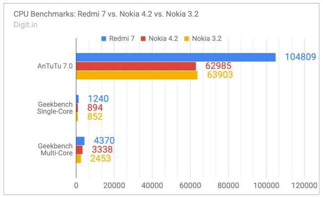
On CPU benchmark tests, the Nokia 3.2 bagged decent scores. Its scores were similar to those of the costlier Nokia 4.2. On AnTuTu 7.0, the Nokia 3.2 scored 63903 points. On the same test, the Nokia 4.2 bagged 62985, and the Redmi 7, 104809. On Geekbench’s Single-Core and Multi-Core tests, the Nokia 3.2 scored 852 and 2453 respectively. In comparison, the Nokia 4.2 scored 894 and 3338 on the same two tests respectively. The Redmi 7 trumped both phones again by scoring 1240 and 4370 on the same two tests respectively.
In everyday use scenarios, the Nokia 3.2 review unit’s performance was underwhelming. There were frequent stutters in animation, especially while returning to the home screen, switching between apps, and pulling the notification bar down. The phone would often skip frames while animating essential elements within a menu, making the phone looking slower than it actually is. Launching common apps like Chrome and YouTube took about four whole seconds to happen, which is the time it takes to finish, say, one complete yawn. In summary, the Nokia 3.2 is usable but just about. The general impression one gets after using it for a couple of days is that it’s a sluggish device, especially when it comes to pushing pixels to the screen.
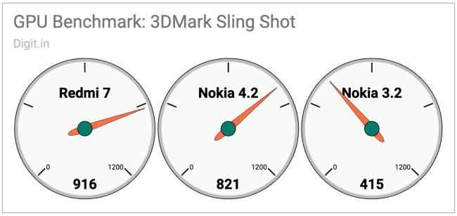
On GPU benchmark tests, the Nokia 3.2 scored quite badly. For example, on 3DMark’s Sling Shot, the phone scored 415 points. In comparison, the Nokia 3.2 and Redmi 7 managed 821 and 916 on the same test respectively. Real-world gameplay on the review unit was a disappointing experience. According to our GameBench metrics tool, Asphalt 9 ran at a median frame rate of 8 frames per second. The movement of the player’s and opponents’ cars was jerky and strained. On the other hand, PUBG Mobile ran at a median frame rate of 21 frames per second. This popular battle royale title was more playable than the racing game but was still not free of lags and stutters. “I’ve seen PowerPoint presentations with better frame rates,” commented my colleague, Shrey, as he watched me play Asphalt 9 on the Nokia 3.2. In summary, Nokia 3.2 is NOT the phone to buy if you intend to play a lot of games, especially popular titles like the ones mentioned here. If gaming on a budget is what you're looking for, consider the Redmi 7 instead.
Software
Like all new Nokia smartphones, Nokia 3.2 follows Google's Android One programme. This means that it runs a near-stock version of Android 9 Pie right out of the box and comes with the promise of regular feature and security updates for up to two years. Thanks to features that are native to Pie, the phone supports a new “pill-based” navigation system by default, Adaptive Battery, and Digital Wellbeing. The Nokia 3.2 comes with a bundled app for FM radio. Stock Android fans will be happy to note that the Nokia 3.2 does not come with any unnecessary bloatware or ads.
Camera
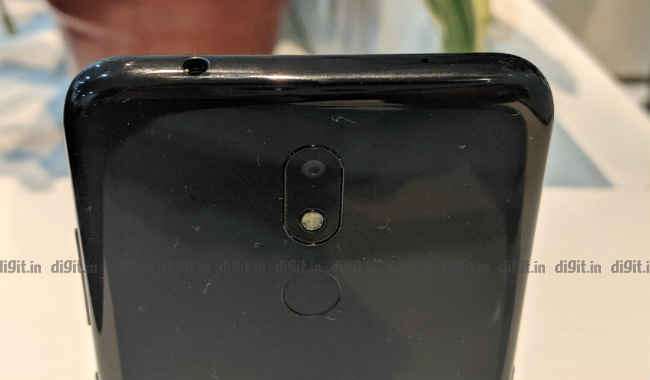
In a world where almost every phone pressed against the cheek of a conversing passer-by sports two cameras on the back panel, the Nokia 3.2 makes do with just one. The single shooter on the Nokia 3.2’s back panel is a 13-megapixel 1.12µm sensor with an aperture of f/2.2. It comes with a single LED flash. The front shooter is a modest 5-megapixel 1.12µm sensor with an aperture of f/2.2 and a 77-degree field of view. The phone uses the front camera for the face unlock feature too.
Photos taken through the rear camera in daytime are bright and colourful but display mild signs of distortion and shake easily and frequently. No portion of the subject is ever in complete focus. Photos taken indoors in moderately low light appear grainy and distorted. The same is true of the photos taken through the selfie camera as well. Selfies taken in bright light indoors have ample detail but lose clarity when the light goes dim. Turning the front flash (powered by a bright white screen from the display) on helps improve the quality but doesn’t get rid of the noise. In summary, the Nokia 3.2's overall camera performance is better than that of the Nokia 4.2 but only by a little. In summary, the Nokia 3.2 has a decent pair of cameras but does not claim photography as its primary area of strength.
The default camera app on the Nokia 3.2 is not as slow or ungainly as the one on the Nokia 4.2 but it is sluggish nonetheless. The app takes time to focus on a subject, capture an image, and preview it. It does not come with an inbuilt portrait or Live Focus mode but it does feature a Square mode for Instagram fans. In summary, the Nokia 3.2's overall camera performance is better than that of the Nokia 4.2 but only by a little.
Disclaimer: Images below have been resized for web. Please visit our Google Photos album for high-res images.

Normal mode, daytime, focus on flower petals

Normal mode, daytime
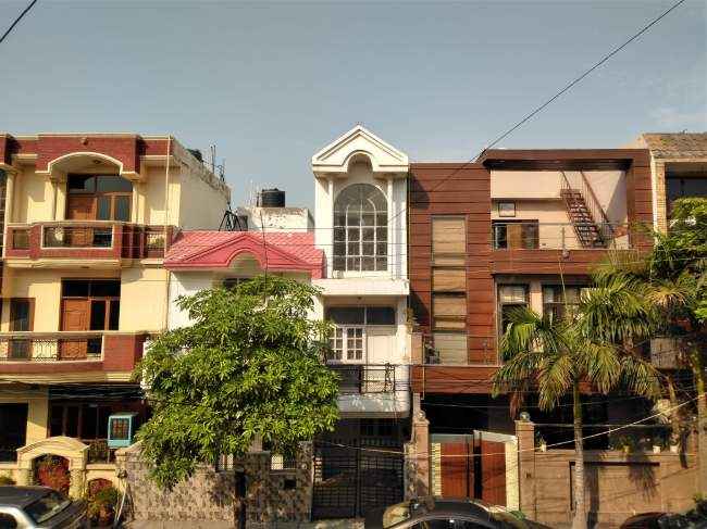
Normal mode, daytime
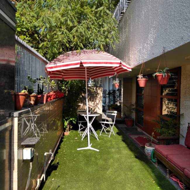
Square mode, daytime

Square mode, low light

Normal mode, indoors
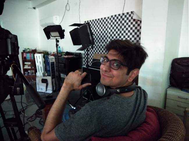
Normal mode, indoors, moderately low light

Selfie with flash (display-powered), very low light

Selfie, indoors
Battery
On our standard battery benchmark test, the Nokia 3.2 scored 514 minutes. In comparison, the Nokia 4.2 managed 530 minutes and the Redmi 7 did 545 minutes on the same test. Keep in mind that the Nokia 3.2 has a 4,000mAh battery. Its loss in battery performance is perhaps due to the lack of a more sophisticated chipset. Expect the phone to last you about one and a half days on a single charge with medium-to-heavy usage.
After about fifteen minutes of running PUBG Mobile, the review unit lost 6 percent of its total charge. After an hour of navigating on the road (with the screen brightness set to max, Wi-Fi and Bluetooth enabled), the review unit lost ten percent of its total charge, which is on par with the Nokia 4.2 and Redmi 7. In summary, the Nokia 4.2 more or less lives up to its two-day battery promise.
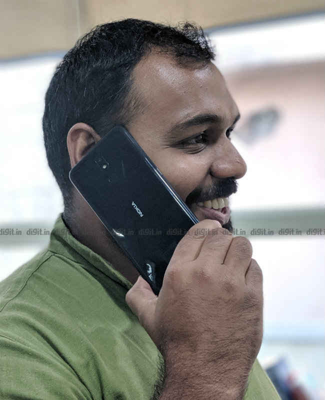
Bottom Line
The Nokia 3.2 variant line-up ends where the Nokia 4.2 begins. According to Nokia’s website, the 3GB RAM variant of the Nokia 3.2 costs Rs 10,790. The 3GB RAM variant of the Nokia 4.2 costs Rs 10,990. This slim difference in price gives a buyer very little reason to consider the Nokia 3.2 over the Nokia 4.2. In almost every way except the screen size, the Nokia 4.2 is better and offers more bang for the buck. Unless you desperately crave the larger 6.26-inch screen, go with the Nokia 4.2 if a classy budget Nokia smartphone is what you want to buy. If you're open to other brands, consider the Redmi 7 too. In summary, the Nokia 3.2 offers mediocre performance on almost all fronts, making a very weak case for itself in front of its slightly costlier sibling.

[ad_2]
Source link

Post a Comment