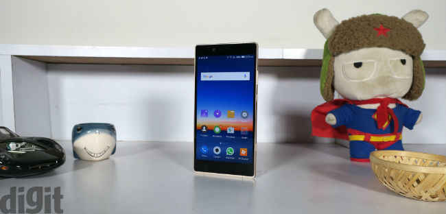
Gionee Elife E8 detailed review
When you decide to drop 35k on a smartphone there are a few things one expects — good build, great hardware under the hood, no premature battery drain and a camera with a lot of beauty modes. The device should make crystal clear calls, too. Chinese smartphone maker Gionee looks to take on the likes of the Nexus 6P, Samsung Galaxy S6 and more with the launch of the Gionee Elife E8. This is Gionee’s first smartphone priced around the 35K mark. Can Gionee cash in on beginners luck with the E8, or are you better off gunning for the brands that dominate this price segment?
Build and Design
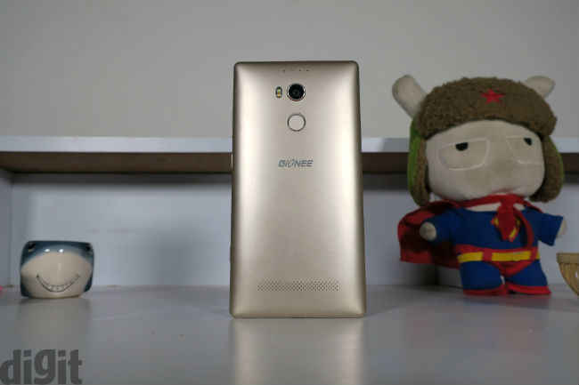
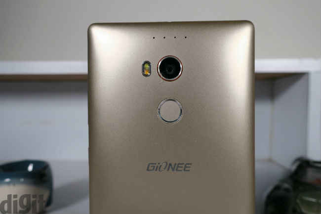
With the Samsung Galaxy S6 we have an all-metal unibody design that will definitely turn heads. With the Nexus 6P, we have a sleek design with the perfect bulge for a camera. Both the smartphones have a very premium feel when it comes to the design, and the materials used to build it are top of the line, too. The Gionee Elife E8, on the other hand, has a plastic body, but the plastic used is of very good quality. You'd be forgiven for thinking that the device was made from metal. The back of the smartphone is removable, but you don't have access to the battery. Under the rear panel you have two SIM card slots along with a microSD card slot. Thank God, there is no hybrid slot here. The rear also houses the camera below, which rests the fingerprint sensor. The back of the Elife E8 is curved, just like we have seen on many other devices. This makes the device easy to hold, making it quite ergonomic. The review unit we received has the metallic gold finish to it and placed next to the gold Nexus 6P, looks a little pale.

Coming to the placement of the buttons on the device, the right has the volume rocker, power button and the dedicated shutter button. Even though the power button isn't textured like we have seen on smartphones from Motorola, its placement on the Gionee Elife E8 is perfect. It is easy to identify the placement of the power button without looking at the phone.
With its 6-inch display, the phone is quite big making it unwieldy for single-handed operations. It works well for two-handed operations, though. The biggest problem I have with the smartphone is that the capacitive buttons that rest below the display aren't backlit. This makes it very difficult to identify the Home menu and multitasking buttons under low-lit situations.
Overall, the build of the smartphone is good, and can survive a few drops from low heights, although we recommend you don't drop it. Cribbing about single-handed operations seems outdated, since large screen phones seem to be the trend these days.

Display and UI
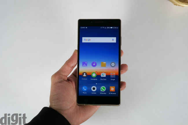
As we’ve mentioned earlier, the smartphone has a 6-inch display, but where it stands out is with its resolution. It has a 2560x1440 pixels resolution, and the display uses an AMOLED panel, which puts it right up there with the creme de la creme of smartphones. Standalone, the display of the smartphone is quite good. It's clear when you read texts, watch movies and play games, but place it next to the Nexus 6P, and we have a problem. Compared to the 6P, the Gionee Elife E8's display has a blue tint to it. It has a slight hue bias, and dim saturation. At full brightness too, the display is a little dim when compared to the Nexus 6P at full brightness. In outdoor conditions, the brightness is good, and viewing angles are good too, on the Elife E8.
Moving on to the UI on the Gionee Elife E8, the smartphone runs on Android v5.1 Lollipop, with the Amigo 3.0 UI overlaying it. The UI is quite similar to what we’ve seen on other smartphones. There is no app drawer, and the Settings menu is a little different from stock Android. The drop-down notification gives you the notifications only. For quick settings, you need to swipe up from the bottom of the display. You have access to eight shortcuts from the pull-up drawer, and you have a bunch of options to choose from as far as these shortcuts are concerned. This is similar, but is better than the notifications tray we have seen on the QiKU Q Terra. In the Q Terra, you have duplication of shortcuts between the pull-up and drop-down notifications. It’s a lot cleaner on the Elife E8.

A cool feature that I stumbled upon when using the smartphone is “Fake call”. Put simply, your smartphone rings and a female voice at the other end says, “Can you send me the files please?” This is a very cool feature to have in a smartphone, and I did use it to get out of sticky situations at home. Another interesting feature of the Amigo UI is the changing wallpaper. There are five wallpapers that keep cycling and fresh wallpaper sets are downloaded too, on the device. It's nice to see the wallpaper change regularly without manual input.
Apart from the above-mentioned features, there is little difference in the OS between China and India. I haven't used the Amigo UI in China, but some that have used it have told me that the UI has its own version of Google Now, which is very impressive. Alas, the feature hasn't trickled down to India.
Overall, the display of the device is impressive but when pit against the competition, it falls short. The UI is interesting with its features on offer, and delivers a lag- and bug-free experience.

Performance
Before we delve into the performance of the Gionee Elife E8, here is a quick look at the specifications of the smartphone. As we've mentioned earlier, the smartphone has a 6-inch AMOLED display with 1440x2560 pixels resolution. Under the hood, the device has the MediaTek MT6795 Helio X10 chipset with an octa-core CPU clocked at 2GHz, coupled with 3GB of RAM. It has 64GB of built-in storage, expandable by an additional 128GB via a microSD card. The rear of the smartphone has a 24MP camera with OIS, phase detection autofocus and a dual-LED (dual tone) flash. The rear camera can also shoot video in 4K. The front has an 8MP selfie camera. A 3500mAh battery powers the entire package.
Moving to the benchmark performance, here is how the smartphone compares to other devices in its price range.
From the benchmark scores, it is clear that the Gionee Elife E8 isn’t the best but it scores well nonetheless.
Moving on to everyday performance, the device worked very well, be it texting, calling, playing games, watching videos, playing music, and more. Despite having the speaker at the back of the device, it was loud and clear. Placing the smartphone on a table while playing music did muffle the audio a little bit, but not as much as we have seen on other devices.

The Gionee Elife E8 houses a fingerprint sensor. One noticeable thing is that the fingerprint sensor is considerably dented when compared to the likes of the Nexus 5X, 6P, Honor 7, or even the iPhone 6s. This isn't a bad thing by any means. It just ensures that your finger gets to the sensor rather than partially touching it. The fingerprint sensor works well, even if it isn't as fast as Nexus Imprint.
Moving on to the camera performance of the Elife E8, it is really good. Images produced are sharp, clear, and it is easy to achieve a depth of field effect by simply tapping the area you want to focus on before hitting the shutter button. You have a bunch of shooting modes at your disposal, such as face beauty, night, magic focus (for getting better depth of field), and more. Put simply, if you are looking for a smartphone with a great camera, you can definitely consider the Elife E8.


Click to enlarge the images
The call quality from the Gionee Elife E8 is good. It has good audio at both ends, and the only time we faced trouble was with the network.
Watch Gionee Elife E8 In-depth Review Below
[embed]https://www.youtube.com/watch?v=rK6_kkT4q1E[/embed]
Bottomline
Overall, the performance of the phone is good. I handed the phone to a few of my friends, and at first glance they weren’t impressed and I don’t think you can blame them, as the phone is simple to look at. They weren’t very receptive of the Gionee brand, either. It was only when we started clicking a few pictures that they were impressed. They were also impressed when the phone outlasted their devices in terms of battery life. It was a process, trying to convince them about the features of the smartphone, and at the end of the day, I don’t think they were impressed. At a price point of 35k, it's difficult to recommend the Gionee Elife E8 to brand-conscious people with a closed mind. The device isn’t perfect, but is great with what’s on offer. The camera is great, and the overall performance is hiccup-free. But, handing the device to the non-techie community that I'm associated with and asking them if they would buy the device, I am yet to receive a positive answer. Some people diss the interface, others talk about the brand, some say it doesnt look like a 35k smartphone, and there are only a handful of people that agree with me that it's a great device to consider. I really like the phone for what it does. The battery life is better than the Nexus 6P (which is my ideal weapon of choice), and the camera produces stellar images. That technically should be enough, right?

[ad_2]
Source link

Post a Comment