RealMe 1 128GB detailed review
Oppo has been a player in the Indian smartphone market for quite some time now. The China-based company, owned by BBK Electronics has positioned itself more as a premium brand in the country. Most of Oppo’s offerings have been more or less expensive with a strong emphasis on selfies. One could say Oppo’s offerings are more of a lifestyle device than just a piece of technology. However, the highest demand in the smartphone market in India is for mid-range phones that are low on price and high on features. Oppo wanted a piece of the mid-range cake, but being a premium brand, it can’t just come out with a cheap phone. Hence the brand, Realme. Just like what Xiaomi did with the Redmi brand, Realme wants to do the same for Oppo.
But whether the bet of introducing a new brand will pay off for Oppo or not is fodder for another discussion. The focus right now is whether Realme 1, the first phone under the new sub-brand is an attractive proposition. The phone certainly look different and the diamond black flair adds to the premium charm of it.
The Realme 1 launched in India exclusively to take on the Redmi Note 5 Pro, but how far does it go to settle the argument? We find out.
Design
The Realme 1 looks distinctly different from all other phones at its price, thanks to the diamond-like reflective body. The phone is housed inside a fibre-glass casing that has been cut at different angles such that each section of the glass back turns to a different shade of black when light is reflecting off it. It does look a lot like a diamond. If you like your gadgets shiny and glossy, this phone will catch your eye. The same glossy finish runs along the edges as well.

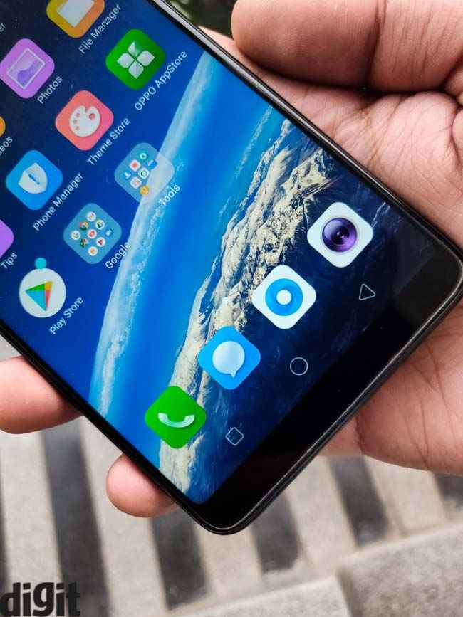
The front is all screen. There are no capacitive navigation button on the front. Even the fingerprint sensor is missing. The Realme 1 relies only on facial recognition for authentication. It’s a brave move by a brand that’s taking its first plunge in a highly competitive market, and other than just being perceived as future forward, it’s actually detrimental to the experience. The user loses out on the reliability of the fingerprint when authenticating purchases. The face unlock is quick, but isn’t reliable enough to keep user’s data secure. You can use facial authentication to access the private space (where you can store apps and data securely), and private apps (that are password-locked). In a practical scenario, the phone was unlocked by a colleague by simply pointing it at my face from a distance.
Apart from the diamond-black finish, it’s a pretty straightforward phone. It rocks the in-vogue univisium form factor and is just 7.8mm thick. There’s an ugly bulge along the edge of the phone that messes with the grip. The screen takes up most of the real-estate up front. The screen-to-body ratio is around 84 percent, which Realme managed to do by fitting the usual 6-inch display in a smaller 6.14-inch frame. The phone is offered in two more colours — Red and silver, but that will be available later in June.
Display
The Realme 1 sports a standard-issue 6-inch Full HD+ display of 18:9 aspect ratio. The panel is just about average with decent colour reproduction. The colour tones are slightly on the cooler side and brightness isn’t high enough to be visible properly when outdoors. In fact, there’s some colour loss at peak brightness and texts appear faded under direct sunlight. The panel quiet reflective too. You get the usual blue-light filters and options to tweak the colour temperature.

The good part about the panel is that it takes up most of the real estate up front with minimal bezels on the top and the bottom. The sides are also quite thin, which gives off an immersive feel to the content.
Performance and UI
The Realme 1 wants to be the phone of choice for mid-range buyers. The undercutting price point is one instance where it shows. But more than that, it’s the brand’s attempt to beat the best in its maiden attempt that brings out the competitive attitude of the company.
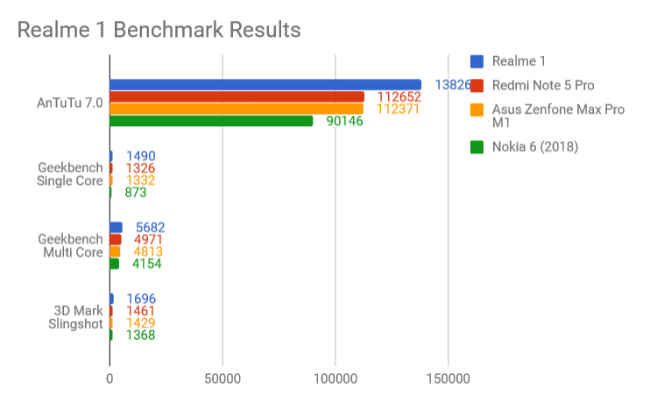
The Realme 1 is powered by the MediaTek Helio P60 SoC which is MediaTek’s most advanced chipset. It comes with an AI chip inside that can compute machine learning tasks on the device itself. It is what powers the facial recognition and the battery efficiency, apart from other things. It’s an octa-core chipset built on a 12nm FinFET process with four Cortex A53 and four Cortex A73 cores, all clocked at 2GHz frequency. On paper it’s faster than its Qualcomm counterpart, as the benchmark results from AnTuTu 7.0 and Geekbench will state. However, when I monitored how the chipset was being used, I observed some anomaly. It seemed for both the benchmark tests, which is comprised of multiple small tasks that stress the CPU to measure performance, the chipset was running at a constant 2.0GHz, irrespective whether the load on the CPU was minimal or at its peak. It could either be an anomaly with the unit I received or Realme is gaming a popular benchmark tests. In a more real world scenario, when the performance was measured while playing the new PubG Mobile game, the CPU speed matched the load put on it. The AnTuTu score for the Realme 1 was 138260 against the Redmi Note 5 Pro’s 112652. The Geekbench Single Core and Multi Core scores are also higher at 1490 and 5682 respectively. But in both cases, the CPU was artificially plonked up to eke out a better score.

We performed a similar analysis on the Redmi Note 5 Pro which proved to be more consistent in responding to CPU load both during synthetic benchmark tests and real world scenarios. The Realme 1’s anomaly seems a little too deliberative. Nevertheless, there’s 6GB RAM and 128GB storage on the unit we re. It leaves enough resources free despite a heavy user interface. It also support dual VoLTE which is useful in the Indian context.
The Realme 1 relies on Oppo’s Colour OS. It’s definitely functional like all Android-layered user interfaces these days, but I wouldn’t call it particularly appealing. It lacks the attention to detail that MIUI is known or the simplicity of stock Android. Instead, the UI seems cluttered with disproportional icons and overall looks quite cartoonish. It does come with a game mode, a private space and the usual bells and whistles of Android Oreo, but that doesn’t take away the fact how uninviting the UI looks for a nitpicking user.
Camera
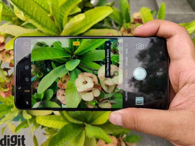
The fate of smartphones these days is decided by how good the camera is. The Realme 1, in that section, is quite underwhelming in comparison to the competition. It has a single 13-megapixel sensor at the back while on the front is an 8-megapixel shooter. The focus, unsurprisingly, is on selfies and portrait shots. The phone relies on Oppo’s AI algorithms to fine-tune the photos which the company claims works by analysing 296 recognition points to understand the skin tone, age, gender, etc. Based on that analysis, the phone applies one of 8 million ‘beauty solutions’ to the image.

The end result is simply a photo with extreme layers of softening, so much so, that all spots and blemishes are hidden. It was a tad difficult for me to accept the effects, but I suppose there’s a demand for them in a country where fairness creams are one of the highest selling products. If beautification is what you’re seeking from a smartphone camera, the Realme 1 will be a pure delight. But if you’re a little more serious about taking good photos, the phone might leave you hanging.

In daylight, the photos have ample highlight clipping. There’s practically no detail in the bright sky in the photo below. Furthermore, the camera tends to saturate the colours more than they are in reality. It also lacks the desired dynamic range.

Indoor shots are a little more polished. The controlled light brings out the good side of the camera. There’s more controlled AI enhancement and the little that it does, it makes objects look much better than they are in real. You get good sharp images with a slightly warmer white balance. There’s some glare off the source of light though, which might be a lens issue.
Under low light, the camera fails to show much promise. Grains show up if you try to dial the exposure higher to take an image under poor lighting, with little to no detail. The shutter speed is actually dialled up when there’s less light which demands a steady hand and if the object is moving, you get a blurred photo.
The portrait mode is present both on the front and the back camera. The Realme 1 relies on software to simulate the depth-of-field effect. It’s nowhere as consistent as the Redmi Note 5 Pro, but it does the job as far as blurring the background is concerned.

Battery
The Realme 1 is powered by a 3410mAh battery. For those comparing, that’s a hairline more than what Xiaomi’s best mid-range phone offers, and the battery life of the phone is more or less at par. The phone managed to run for 6 hours on the PCMark Battery 2.0 Test which should easily convert to over a day’s usage for an average user. For the review, I used the phone to browse the internet, play games, take photos and use social media. It did last me for a typical work day and then some more. The Helio P60 chipset seems to be quite energy-efficient and based on the battery life, Realme seems to be delivering on its promise of using machine learning to manage resources. The battery section in the Settings app gives some insight in how much juice each app takes and apart from the resource-intensive game I was playing, the UI sucked up most of the battery. When you are running out of power on this phone, you know what to blame.

Bottomline
The debutante Realme 1’s ambition to compete with the likes of Xiaomi Redmi Note 5 Pro is quite apparent. It looks boldly different from the rest, but a good design will only take it so far. The performance is nowhere near the best in the market, despite the benchmark results telling you so. The camera which is propped up by on-device machine learning ends up delivering unnaturally softened photos while the UI comes off quite amateurish. The battery life is the only saving grace, but overall this phone isn’t what it advertises to be. Oppo’s decision to come out with a new sub-brand to cater to the highly competitive mid-range market may be driven by consumer demand, but there’s little in the phone to entice buyers, apart from a good looking device.
[ad_2]
Source link

Post a Comment