Nokia 2.2 detailed review
HMD Global Oy’s smartphone launches for 2019 seem to be something of a slow burn for the popular Nokia brand. After showcasing a few models at the Mobile World Congress in February, it went about releasing them in certain markets in a slow yet steady manner. Fortunately, India is one of those markets and we’ve just got our hands on yet another Nokia x.2 model. This one, however, is the cheapest Nokia smartphone you can get without getting into the Android Go universe. It’s the Nokia 2.2.
A few weeks ago, we reviewed the Nokia 4.2, which was the brand’s first launch in India for this year. A little after that, we reviewed the Nokia 3.2. We concluded that it makes more sense to spend a few more hundreds and invest in the more refined Nokia 4.2, unless getting a larger display was the ultimate goal of the phone buyer. Where does the cheaper Nokia 2.2 stand then? It’s got a MediaTek Helio A22 chipset with up to 3GB of RAM. Let’s find out.
Build and Design
According to the smartphone's product page, the Nokia 2.2 is “comprised of a solid polycarbonate body” that has “a high gloss finish”. In reality, the Nokia 2.2 looks and plays the part of a budget smartphone with very ordinary levels of build and design. The Nokia 2.2's glossy back panel seems sturdy and presentable in the hands but not particularly strong or eye-catching. Drumming idly on the back panel with your fingers causes a hollow plasticky sound to emanate from the back panel. You'll want to buy a bottle of Colin with this phone because the back panel is a palm-sized magnet for fingerprints and smudges.
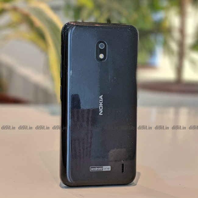
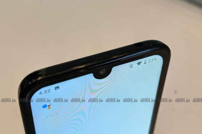
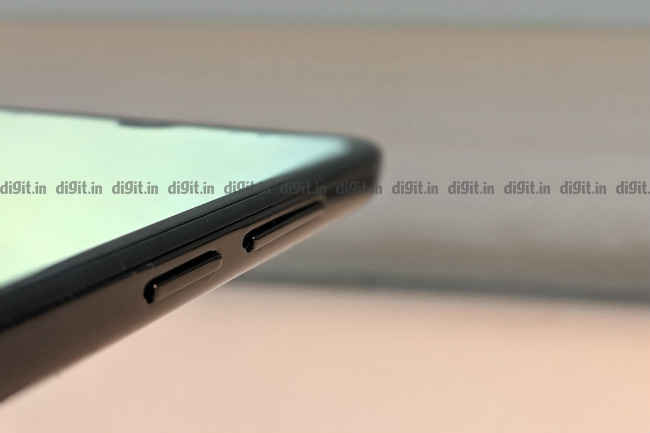
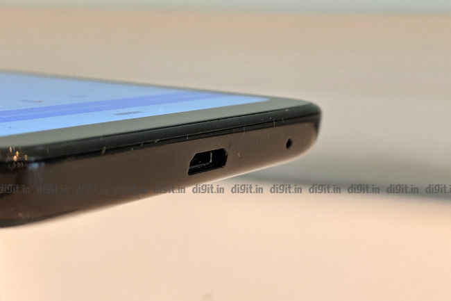
Being a budget smartphone, the Nokia 2.2 does not get a dual-camera setup on the back. Instead, it gets a modest single-sensor shooter on the back with a single LED flash. The top side of the Nokia 2.2 is home to a 3.5mm audio jack but that’s it. There’s no secondary microphone anywhere in the vicinity. The left side of the phone houses a dedicated Google Assistant key, which, by default, fires up the virtual assistant even when the screen is turned off. The bottom side of the Nokia 2.2 gets a microUSB port and the primary microphone. The right side is home to the power button and volume rocker, which are a little hard to press because of the steep inward curvature of the body.
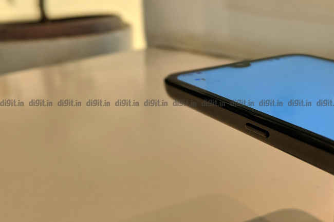
In addition, the lower right side has a tiny tab with which the user can remove the back panel entirely. On the inside, we see two cards slots on either side, one of which houses the primary SIM card and a microSD card. The other slot houses the secondary SIM card. Most of the space inside is occupied by a user-removable lithium-ion polymer battery. Named HQ510, the battery has a rated capacity of 2920mAh. It goes without saying that the Nokia 2.2 does not get an IP rating for water and dust resistance. Unlike its brethren, it does not get a notification light. In summary, the Nokia 2.2 has a pretty decent build and design for its price.
Display and Audio
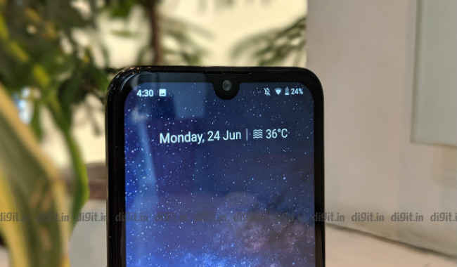
The size of the Nokia 2.2’s display is the same as that on the costlier Nokia 4.2. It’s a 5.71-inch LCD panel with a resolution of 720 x 120 pixels. The top portion of the display is home to what Nokia likes to call a “Selfie notch”. In simpler words, there’s a tiny circular notch at the top for the phone’s single selfie camera. Thanks to Android 9’s native support for display notches, bundled apps like YouTube play nicely with the protrusion. While games like Asphalt 9 fill up the screen area around the notch, games like PUBG Mobile don’t. It’s a trend we’ll all have to live with, whether we like notches or not.
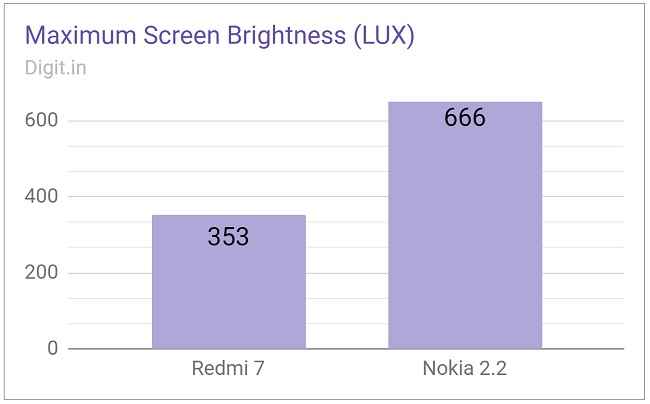
Though the Nokia 2.2 appears to share its display with the older Nokia 4.2, there’s a noticeable drop in quality on the cheaper unit. Colours on the Nokia 2.2’s display look a tad darker than they are in reality. Brightness, according to our test kit, ranges all the way from 5 to 666 LUX, which is plenty enough for viewing in most environments. Like the back panel, the display has a glossy finish, which makes the surface easily prone to smudges and fingerprints. The aforementioned bottle of Colin and a sheet of tissue paper should go a long way in correcting the undesirable “glossy panel” effect.
If you’re buying the Nokia 2.2 for good audio, prepare to be disappointed. It has a single loudspeaker on the back panel, which is decent for calls, ringtones, and alarms but no good for music. Sound from the tiny driver is muddled and sometimes unclear. Accidentally placing a finger or palm over the speaker grille can mute the sound output almost entirely. Luckily, there’s a small bump around the grille to give the phone some lift when it’s placed on a tabletop surface. But if the phone is lost somewhere between your bed, blanket, and pillow, there’s a chance you’ll end up missing your morning alarm.
Performance
The Nokia 2 and Nokia 2.1 relied on a Qualcomm Snapdragon chipset (the Snapdragon 212 and Snapdragon 425 respectively) but the Nokia 2.2 breaks that trend and employs instead a MediaTek Helios A22 chipset. Built on a 12-nanometre process, the Helios A22 offers four ARM Cortex-A53 CPU cores at 2.0GHz. The graphics processing unit onboard is a PowerVR GE8320, which, based on our experience with the review unit, feels a tad more responsive than the Adreno 504 on the Nokia 3.2’s Snapdragon 429 chip. The Nokia 2.2 is offered in two variants: one with 2GB RAM + 16GB internal storage (Rs 6,999) and another with 3GB RAM + 32GB internal storage (Rs 7,999). Our review unit was of course the latter.
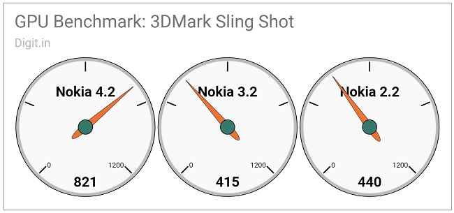
The Nokia 2.2 review unit fared more or less as decently as the Nokia 3.2. On AnTuTu 7.0, the unit scored 61554 points, where the Nokia 3.2 scored 63903. Geekbench refused to run on the Nokia 2.2 owing to server connectivity issues. On 3DMark’s Sling Shot, the Nokia 2.2 scored 440 points. In comparison, the Nokia 3.2 and Nokia 4.2 bagged 415 and 821 on the same test respectively. On PCMark Storage, the Nokia 2.2 (with its score of 7069) beat the Nokia 3.2 (5574) and the Nokia 4.2 (6965).
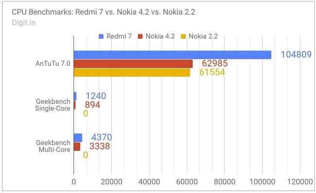
Nokia 2.2 failed to run Geekbench 4 benchmark tests
In everyday scenarios, the Nokia 2.2 review unit was almost a pain to use. Right from the get-go (initial Android setup, i.e.), the phone was slow to respond. Bringing up the default keyboard (Gboard) would take up to four seconds in general. Everyday apps, such as YouTube and Chrome, would take about four to six seconds on an average to be launched and ready for use. Pressing the dedicated Google Assistant key would sometimes result in nothing for about three or four seconds. In summary, get the Nokia 2.2 if you don’t mind waiting for things to happen on your phone.
Gaming on the review unit was an equally painful and disappointing experience. According to our Gamebench metrics tool, Asphalt 9 ran at a median frame rate of 10 frames per second, and PUBG Mobile, 15 frames per second on forced low graphics settings. Playing either game was a challenge. The frames moved at a noticeably low rate and made controlling the player a difficult task. It was neither thrilling nor entertaining to play a game on the Nokia 2.2. It’s best to go with simpler titles on this phone, such as 2048 and Candy Crush Saga.
Software
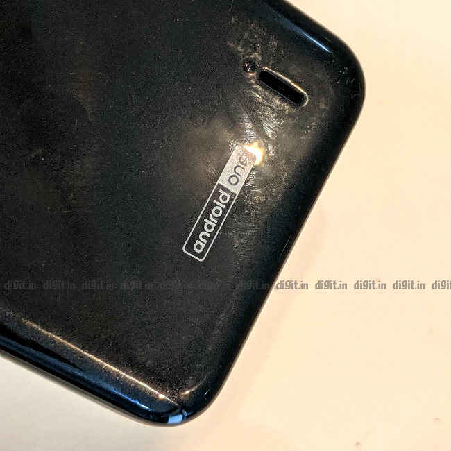
The Nokia 2.2 is the cheapest model from the Finnish phone maker that runs Android One. Models priced below it get the simpler and lighter Android Go. As is the case with any modern Nokia smartphone running Android One, the Nokia 2.2 gets the latest near-stock version of Android, version 9 (Pie). It also gets the promise of regular software updated for up to two years. The UI is clean and easy to use. The app drawer is free of bloatware, so those who prefer stock Android or anything close to it will appreciate it.
The pill-based navigation that was introduced by Google in Android 9 is turned on by default. The UI includes the option to switch to a dark device theme in Settings, which should please those who prefer white text on a dark background. It’s worth noting that this theme setting is not exactly system-wide and that it only changes the appearance of some system elements, such as the notification drawer.
Camera
While many of today’s smartphones are seen with at least two cameras on the back panel, the Nokia 2.2 is seen with a modest single shooter on its back panel. It’s a 13-megapixel 1.12um sensor with an aperture of f/2.2 and autofocus. It’s accompanied by a single LED flash that doubles as the phone’s torch. The camera on the front is a 5-megapixel unit that’s ensconced in the phone’s “Selfie notch”. The default camera app on the Nokia 2.2 features modes such as HDR, panorama, low-light enhancement, time lapse, beautification, and Google Lens.
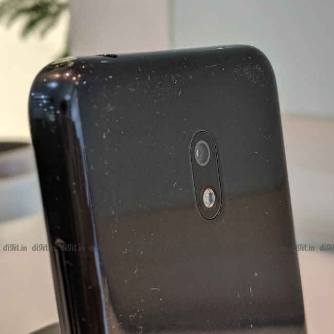
Just one camera on the back
Photos taken in daylight through the Nokia 2.2’s primary (and only) sensor are somewhat dull and lacking in detail. Colours too appear faded and washed out. For example, the leaves on a tree seem drier than they are. Zooming in reveals the loss in detail and focus in many elements of a frame. Photos taken indoors however, are mostly noisy and colourless. Shots taken inside say, a conference room, blur easily. Lowlight photos are grainy and blurry and are hence best avoided. Selfies, on the other hand, appear significantly sharper around the main subject, though they too could do with more colour. They turn noisy and blurry under low light just as much as regular shots through the rear camera.
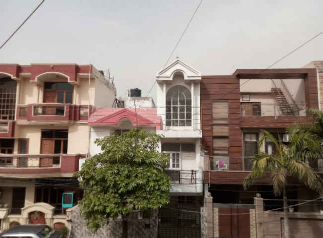
Normal mode, outdoors, daylight
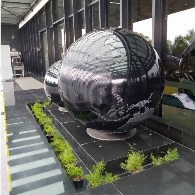
Normal mode, outdoors, daylight
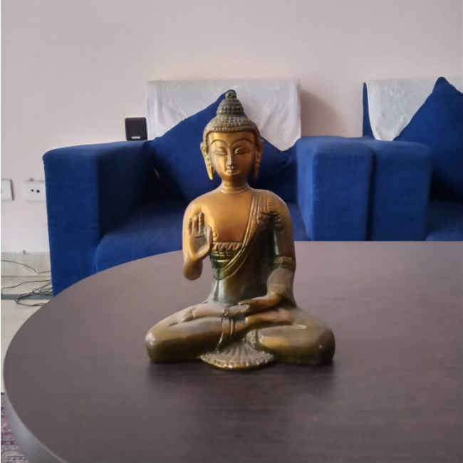
Normal mode, indoors, regular indoor lighting

Normal mode, indoors, slightly low light

Normal mode, indoors, low light

Selfie camera, indoors, regular indoor lighting

Selfie camera, indoors, low light
The default camera app is slow to react and nearly unusable. On many occasions, the app on the review unit stalled and closed itself when I tried to view a photo that was taken a few minutes ago. Switching between photo and video modes takes nearly two seconds to happen. A “beauty” slider can be set for both regular photos and selfies. All in all, the Nokia 2.2 cannot be considered for its optical prowess. If your budget can be stretched to accommodate a Redmi 7 instead of the Nokia 2.2, your mobile photography experience should improve significantly. You can read more about the Redmi 7 and its camera quality here.
Battery
The battery setup on the Nokia 2.2 is rather unique. Like Nokia models of yore, the Nokia 2.2 has a user-removable battery. The battery on the review unit bore the model number HQ510 and had a rated capacity of 2920mAh. A few years ago, users whose phone featured a user-removable battery had the option of replacing the unit themselves when the battery wore old. But at the moment, it’s hard to say if it’s an advantage for the Nokia 2.2 because a Google search of the model number returns very little usable information. We’re not sure if Nokia will sell the battery online.
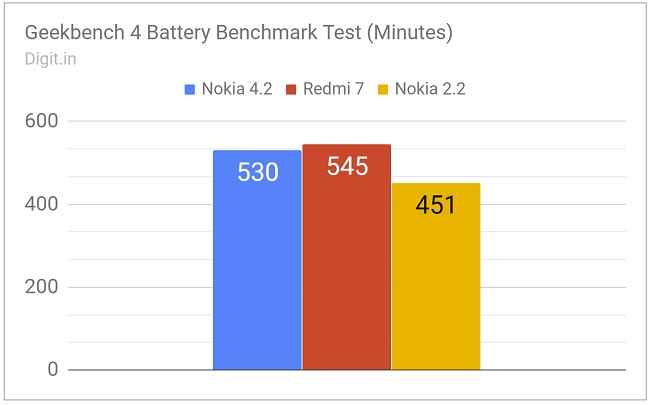
According to our standard battery benchmark test, the Nokia 2.2 scored 7 hours, 31 minutes. In comparison, the Nokia 4.2 and Redmi 7 scored 8 hours, 50 minutes and 9 hours, 5 minutes on the same test respectively. In everyday use scenarios, the Nokia 2.2 review unit lasted a little over a day with moderate use, which included some thirty minutes of gaming, twenty minutes of browsing, and a few app installs. When the phone remained in my bag unused for two full days, the battery dropped from near full to 30 percent. Charging from 10 percent back to full took nearly two full hours on the standard bundled charger. In summary, the Nokia 2.2 has a decent battery life but could have done with better.
Bottom Line
The Nokia 2.2 entered the budget smartphone market with a price tag of Rs 7,999 (for the 3GB RAM/32GB storage variant) at a time when its more sophisticated brother, the Nokia 4.2 received an updated price of Rs 10,490 (for the similar 3GB RAM/32GB storage variant). While you might save a couple of thousand rupees with the Nokia 2.2, you’ll miss out on a lot in terms of features and quality. Performance too takes a hit with the Nokia 2.2’s weak MediaTek Helio A22 chipset.
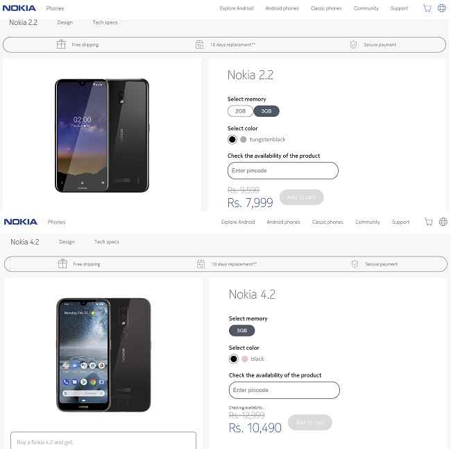
Nokia 2.2, Nokia 4.2 Product Page
When compared with phones like the slightly costlier Redmi 7, the Nokia 2.2 has little to set itself apart with, except for the fact that it comes with Android One. Though it promises timely updates and a clean stock Android-like UI, it renders itself nearly unusable because of the phone’s underpowered chipset. Forget the Nokia 2.2; get the beefier Nokia 4.2, or the Redmi 7.
[ad_2]
Source link

Post a Comment