Samsung Galaxy S10e detailed review
When we think of flagship devices in 2019, form factors that come to our mind range from giant phablets to bezel-less, edge-to-edge displays to even displays that fold. And while Samsung did launch flagships that are large, that can fold and have more cameras than you can keep count, the Korean giant also came out with the Galaxy S10E, a compact flagship to cater to a segment of users that have mostly been ignored in India. Compact flagships used to be Sony’s forte with the Xperia Compact series that did launch in India till a few years ago. There’s also the Google Pixel 3, supposedly aimed at users looking for a smaller phone without compromising on the performance. But no device out there presently can match the size and compact form factor of the Galaxy S10E. Yes, we checked with all other compact flagships kept side-by-side. But form-factor aside, the Samsung Galaxy S10E doesn’t seem to skimp on the features that define the Galaxy S10 flagship lineup, save for a few missing features here and there. And for a price of Rs 55,900, it certainly doesn’t demand a kidney. But with the iPhone XR, Google Pixel 3 and even the OnePlus 6T vying for the attention of a price-conscious smartphone enthusiast, can the Samsung Galaxy S10E offer enough benefits for your money? Let’s find out.
Design
The Samsung Galaxy S10E can be credited for reviving the seemingly dead compact flagship segment. Only the Google Pixel catered to the segment so far and the S10E becomes a good alternative to go for if you are a stickler for small phones. In fact, the Galaxy S10E is even smaller than the Google Pixel 3, and in front of it, the iPhone XR looks like a giant phablet.
It’s all glass, though, on the front and the back, as has been the case with Galaxy flagships since the Galaxy S6. However, while every year Samsung uses the latest generation of Corning Gorilla Glass, the Galaxy S10E has Gorilla Glass 5 on both the front and the back. Samsung does bundle a perforated case in the box which saved the phone from receiving any damage when it fell from pocket height.
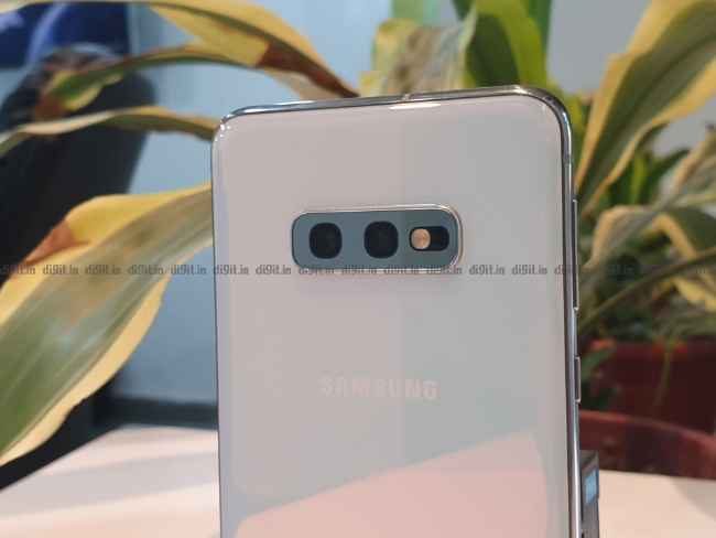
The prism white reflects new colours every time you pick it up.
The Galaxy S10E is offered in two colour variants in India. The Prism White and Prism Black variants are identical to the Galaxy S10’s design. The black variant is glossy but doesn’t reflect colours when held against the light. The Prism White variant, however, reflects new colours every time you pick it up. It looks perfectly premium, and even though this is the ‘budget’ flagship, there has been no compromise in the build and design of the phone. The only place where Samsung seems to have saved costs is in the fingerprint sensor. The larger Galaxy S10 and the S10+ have an ultrasonic fingerprint sensor embedded under the display, but the S10E comes with a capacitive fingerprint sensor embedded into the power button on the right side. While it becomes muscle memory after a few days of use, I often found the fingerprint sensor and especially the gestures associated with the sensor interfering with my activities like gaming. However, when compared against the in-screen fingerprint sensor on the Galaxy S10, it’s much faster and offers instant access to the lock-screen when the screen is off.
Despite being made of glass, the Galaxy S10E doesn’t feel slippery at all. The compact form-factor also allows for a solid grip in the hand and it’s easy to use the phone one-handed. Only the bottom bezel is quite distinct and while the screen doesn’t curve around the edges (another cost-saving feature) like in the Galaxy S10, the borders around the screen are minimal enough to not come in the way. Speaking of buttons and ports, the S10E has only the power button on the right while the volume rockers and the Bixby button are on the left. The power key with the embedded fingerprints takes up a relatively larger area and is flush with the body which makes it difficult to locate for the first few times. Nothing that you won’t get used to, though. Samsung also finally gave in to demand and made the Bixby button customisable to launch other apps.
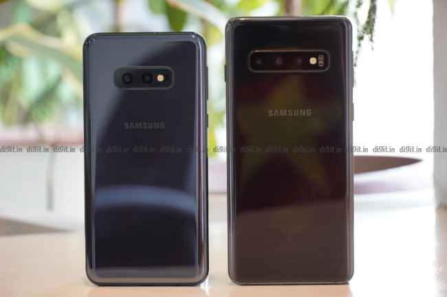
Galaxy S10e's size in comparison with the Galaxy S10
Especially noticeable is the new punch-hole camera. The 10MP front camera is embedded under the glass. Credit has to be given to Samsung for staying away from the notch that seem to be there on almost any and every smartphone last year. The company leapfrogged ahead to drilling the camera inside the display. The new design is much less intrusive. You can in-fact use
interesting wallpapers to disguise the camera. There’s an entire sub-reddit for that even.
The design and build of the Samsung Galaxy S10E is every bit premium. Don’t let the lower price let you think otherwise.
Display
There might not be many takers for a compact phone these days, but Samsung gives you enough reason to not look elsewhere. While most manufacturers tend to compromise on the display of their budget offerings, Samsung went all out and put a HDR10+ certified display on the Galaxy S10E. Compared to last year’s ‘budget iPhone’, it’s miles ahead. The Galaxy S10E’s 5.8-inch display has FullHD+ resolution with support for next-gen HDR standard. It’s the same display that’s on the larger Galaxy S10 and the S10+ with only the resolution dialed down from 2K to HD.
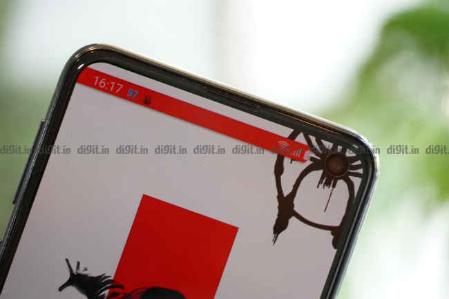
The Galaxy S10e's front camera is drilled into the display
When watching content on Netflix, you will often spot the HDR tag on shows and movies and you can enjoy those in stunning clarity provided the internet speed is adequate. There’s visible difference between the colours and the details on say the OnePlus 6T and the Samsung Galaxy S10E. The iPhone XR despite coming with only a 720p display also did quite well in our display tests, but can’t hold a candle to the perfection Samsung brings to the table when it comes to the display.
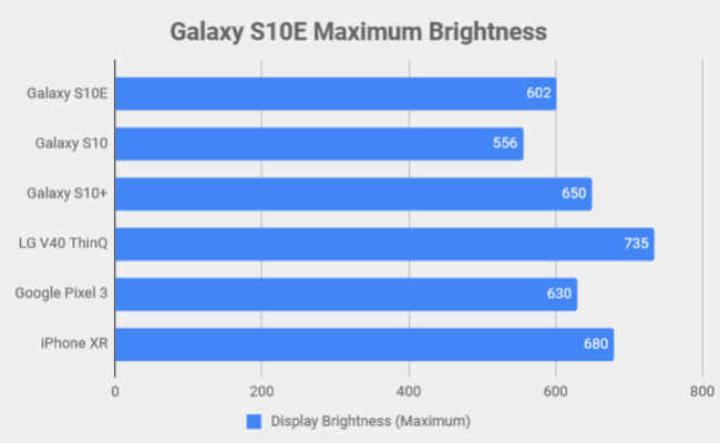
Maximum Brightness (In lux)
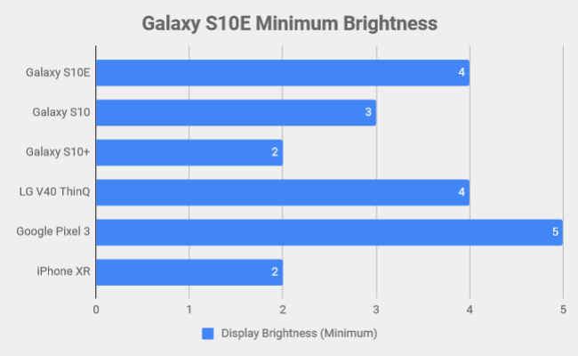
Minimum Brightness (In lux)
We registered peak brightness of 604 lux in our tests while the phone went down to a minimum 4 lux when the brightness was the least. The brightness also gets a boost if auto-brightness is turned on and the proximity sensor senses you are outside in the sun. But then no matter how bright it is outside, the Galaxy S10E’s display never seemed to wash out. It’s perfectly legible under direct sunlight.
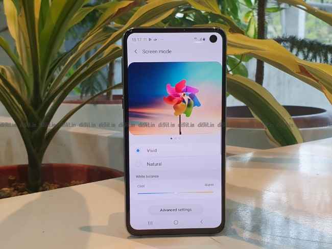
Display settings on the Galaxy S10e
Samsung also offers the ability to tweak the colour temperature, and even set the white balance of each individual colours. By default the Vivid mode is selected that does boost the colour contrasts and saturation. We recommend switching to Natural, where the vivid colours are engaged only when you’re watching HDR content.
Performance
Despite being the smallest of the lot, the compact Samsung Galaxy S10E is just as powerful as its bigger siblings. Under the hood is the same hardware that powers the Galaxy S10 and the Galaxy S10+ — The Exynos 9820. It’s Samsung’s latest flagship chipset manufactured on a 8nm process with a tri-cluster CPU setup. There are two high-performance custom cores based on ARM Cortex-A76 clocked at 2.73GHz, two medium-performance ARM Cortex-A73 cores clocked at 2.31GHz and four high-efficiency ARM Cortex-A53 cores clocked at 1.95GHz. The tri-cluster arrangement apparently allows for a better load distribution between the cores. For instance, the custom cores are engaged only when there’s heavy load like gaming, or shooting at 4K, while the medium cores are engaged when you’re taking photos, or watching a YouTube video. The four efficiency are used the most when you’re just generally using the device. Whether it’s the latest ARM cores, or the tri-cluster setup, the Galaxy S10E runs butter smooth no matter what you throw at it.
The Exynos 9820 is paired with 6GB LPDDR4X RAM and 128GB UFS 2.1 storage. It’s weird how Samsung refrained from using the next generation memory and storage despite pioneering LPDDR5 RAM and UFS 3.0 storage in the mobile space. Nevertheless, between the three variants, there are slight differences in benchmark scores, but if you compare it against the likes of the OnePlus 6T McLaren Edition and LG G7+ ThinQ, both of which are priced in the same range, the S10E comes out on top. However, when pitted against the iPhone XR, Apple’s budget iPhone launched last year, we see some interesting differences. Here’s what the benchmarks revealed —
Benchmarks
CPU
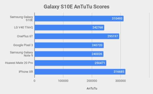
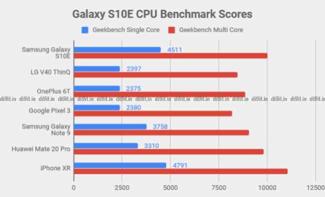
On AnTuTu, the Samsung Galaxy S10E outscored all other Android flagships launched last year, but fell just shy of beating the iPhone XR, while on Geekbench Single Core and multi-core tests, it was bested only by the iPhone XR.
GPU
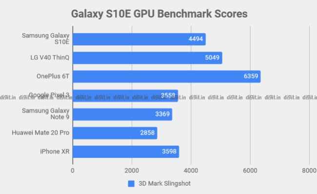
However, when we tested the graphics rendering using 3DMark Slingshot test, the Galaxy S10E managed to beat the iPhone XR, but the LG V40 ThinQ and the OnePlus 6T both performed much better in those tests. The Galaxy S10E also got modest scores for AI performance and VR rendering. We also checked for artificial boosting which some OEMs tend to do when a benchmark app is detected. There was no such issue with the Galaxy S10E.
Daily usage
In day-to-day usage, the Galaxy S10E worked without a hitch. I used the phone as my daily driver and except for the shoddy battery life (more on that, later), I faced no issues whatsoever. I used the phones to write my articles, take photos and edit them on the go using Snapseed and Lightroom Mobile and everything happened quite seamlessly. Considering its compact nature, it took a little time to get used to typing (I was coming from the OnePlus 6T), but once I did, there was no problem in belting out long sentences. The tactile feedback is especially good. There seems to be absolutely no difference between the three Galaxy S10 models as far as performance is considered.
Gaming

Gamebench scores of PUBG Mobile
Gaming on the Galaxy S10E, on the other hand, isn’t the best experience. Firstly, the display is just too small to have a wide screen-space to move your fingers around, and secondly, the Mali-G76 MP12 isn’t the best GPU for mobile games. We played multiple sessions of PUBG Mobile and Asphalt 9 and recorded the frame rates in real time using GameBench. PUBG Mobile gave a frame rate of 37 FPS with 91 percent stability while Asphalt 9 delivered 29 FPS at 86 percent stability. The frame rates are higher than what the Galaxy S10+ and the Galaxy S10 produced while playing the same games at the same settings, but that’s likely because the S10 and the S10+ come with 2K displays, and more pixels mean more time to render, leading to a lower frame rate. Between the three Galaxy S10 devices, the S10E is the best phone for gaming, but overall, the OnePlus 6T still tops the chart in terms of frame rates and stability.
Software
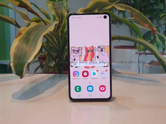
The Samsung Galaxy S10E runs on Samsung’s new OneUI based on Android 9 Pie. It’s a big departure from the Samsung Experience interface that the company offered in the Galaxy S9 and the Note 9 last year. It’s much more seamless and intuitive, but more than that, it’s much more aesthetically pleasing than the older interface. OneUI brings gesture navigation which only involves swiping up from different parts of the screen to navigate. Furthermore, Samsung finally allows users to remap the Bixby button to do just about anything. I used it as a quick access to the camera. However, you won’t be able to install third-party themes and icon packs. Instead, you have to rely on the Galaxy Store to download them, and most of the good ones are not free to use.
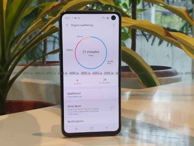
Bixby itself is now much more usable. I particularly liked Bixby routines which activated preset settings at a particular time or location, like turning the Wi-Fi off when I left work. These can easily be done by a third party app like IFTTT, but having it baked in makes it much easier. The Galaxy S10E also comes with Digital Wellbeing which was announced alongside Android 9 by Google which helps monitor your smartphone usage, and if required, even take steps to curb it down.
There are a lot more new features that would require a separate article to talk about. But overall, this is an excellent evolution of the old Samsung interface which was one of the primary reasons most people held back from buying a Samsung flagship. OneUI makes using the Galaxy S10E so much better.
Camera
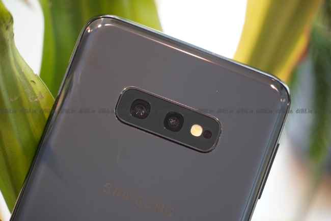
No triple cameras on this one, but you won't really miss the telephoto lens
While there isn’t any compromise in the performance or the display, what makes the Galaxy S10E the least expensive sibling of the Galaxy S10 trio is the camera on the back. Instead of three on the back and two on the front, the Galaxy S10E has two cameras on the back and one on the front. The dual camera stack includes a primary 12MP sensor with variable aperture of f/1.5 and f/2.4 along with a 26mm wide lens, and a 16MP ultra-wide angle sensor with f/2.2 aperture and fixed focus and 123-degree wide field of view. The primary sensor comes with OIS but the wide-angle sensor doesn’t have it, and frankly, doesn’t require it. What the S10E lacks is the telephoto lens that’s there on the S10+ offering 2X optical zoom.
To be honest, you won’t be missing out on much. It’s difficult to tell photos taken from the three variants apart from each other, so it’s safe to say, the cameras are tuned and optimised similarly. The sensor offers excellent dynamic range at daylight, while low-light shots come out fairly bright and usable.
Primary 12MP sensor
While Samsung refrained from getting into a megapixel war that is currently waging with the 48MP camera sensors, the 12MP sensor on the Galaxy S10E manages to take some fine photos, even in tricky lighting. The sensor used on the S10E has a smaller 1/2.55” surface area but has large 1.4um pixel size. If you compare against the 48MP Sony IMX586 sensor, that’s exactly the pixel pitch you get in the binned mode. Essentially, apart from the crazy details the 48MP sensor promises, the S10E’s 12MP sensor is perfectly capable of producing images with good exposure and sharpness.
In the sample above, the colours are perfectly reproduced with high precision. Even a bright sky could not darken the subject. Moreover, the sharpness of the phone is quite high. A 100 percent crop (shown below) reveals how well the details are retained.
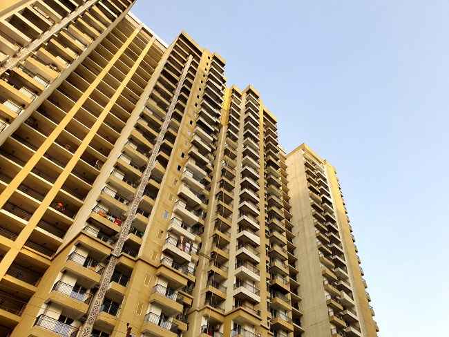
1/320 sec. f/2.4, ISO 50
Having said that, in the samples shown above, Samsung’s aggressive sharpening algorithms does make the lines appear a bit too sharp when zoomed in. However, the exposure and the details are almost always perfect when shooting in daylight.
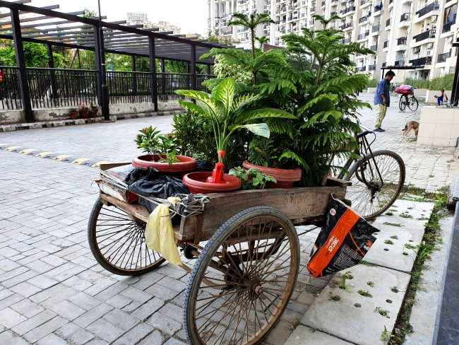
1/125 sec. f/2.4, ISO 64
Like the Galaxy S9 and the Note 9 that came out last year, the S10E’s primary camera also has the dual-aperture mechanism. It can switch between f/1.5 and f/2.4 automatically with the option to do it manually in the pro-mode. The f/1.5 aperture is used to capture low-light images while the f/2.4 aperture is put to use for all other time of the day. At low-light, shifting between the two aperture does result in different exposures, but I’m yet to find one good reason why anyone would attempt to shoot low-light photos at f/2.4 when most smartphones use f/1.8 to f/1.5 apertures across all situation.
Low-light images using the primary camera are much better than what the S9 managed to produce. Earlier, Samsung’s nasty noise-reduction algorithm almost always smudged the details, but this time around, even though there is some level of noise-reduction applied, the result is much sharper with good exposure and contrast. The samples below will tell you the story.

1/50 sec. f/1.5, ISO 800

1/50 sec. f/1.5, ISO 640
A word about the AF system of the Galaxy S10E. The S10E uses the same dual-pixel mechanism to focus on the subject, and this time there are more pixels available to use for auto-focus which greatly improved the auto-focus performance, especially at low-light. The sample below will be a testament to that. I took this photo from inside a speeding auto and the result is quite impressive.
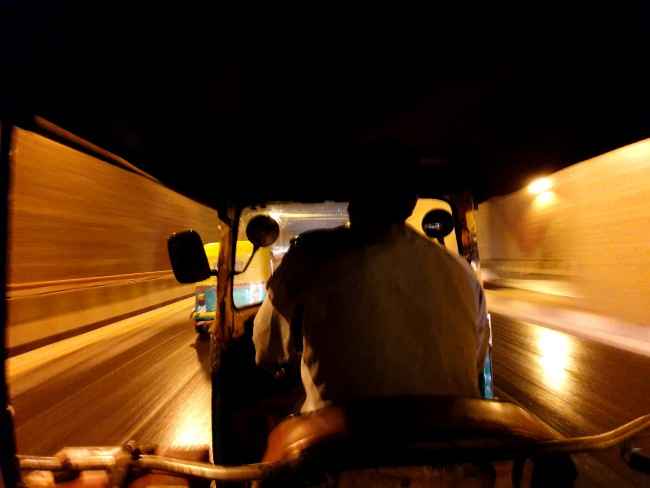
1/10 sec. f/2.2, ISO 640
The Galaxy S10E is also equally good at taking close-up photos. We wouldn’t call it macro as the minimum focusing distance isn’t all that small. Furthermore, Samsung could have enabled AF in the ultra-wide angle camera to use as a macro lens like the Huawei Mate 20 Pro does, but unfortunately the wide-angle lens has a fixed focus.

1/50 sec. f/1.5, ISO 400
Ultra-wide camera
Between the telephoto and the ultra-wide camera, I’m glad the Galaxy S10E retained the ultra-wide angle camera as part of its dual camera system. It’s a good way to stand out from rivals like the OnePlus 6T and to compete head on against the LG flagships which have been the flagbearer of ultra-wide cameras on phones for years. In fact, the S10E’s ultra-wide camera does a much better job than the LG V40 ThinQ. There is barrel distortion of objects that are very near to the lens, but it is expected given that this is a 12mm lens.
However, the lens lacks autofocus and has the focus set to infinity, limiting your shooting options. This makes it tricky to use the camera first, but after a few tries, it’s not hard to figure out the sweet spot. Samsung’s Shot Suggestion feature does come in handy if, like me, you’re not a professional photographer. The feature intelligently analyses the scene you’re shooting and suggests you how to frame it. In most cases, the photos came out straight and well-composed when using the feature.
Using the wide-angle lens to shoot low-light photos isn’t a good idea though. The f/2.2 aperture is too small to take in more light and wide-angle lenses in phones, generally tend to underexpose frames in low-light.
Take a look at a few samples from the ultra-wide camera —
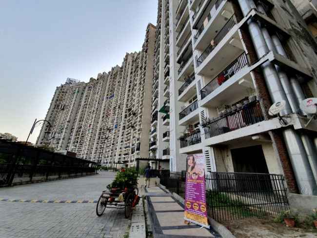
1/500 sec. f/2.2, ISO 50

1/320 sec. f/2.4, ISO 50
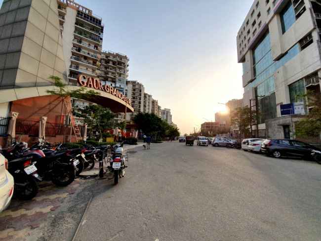
1/800 sec. f/2.2, ISO 50
Portrait mode
The Galaxy S10E may not have a telephoto lens to use a depth sensor, but it still manages to take fine portrait photos with the background blurred. The algorithms are well-optimised to detect the edges of the subject, however, the blurring is not as natural as what the iPhone XS produces. You also have to stand at a particular distance to get the feature working.
Having said that, Samsung introduced some new bokeh effects that does make taking portraits fun. There’s a swirl effect and a zoom effect. Both of these features work quite well. There’s also a third option of colour pop which isn’t quite accurate and often colours elements other than the subject.
You can also adjust the type and amount of bokeh in your photo after shooting it. Here are some samples —

Live Focus mode

Portrait Mode effect

Portrait Mode effect

Colour Pop mode
Selfies

1/15 sec. f/1.9, ISO 2000
The Galaxy S10E doesn’t have two cameras on the front like the S10+, but the single camera drilled into the display works well enough to not miss the second camera. You will not get a wider field of view, but the selfies are the same as the S10E’s bigger siblings. Outside under the sun, the 10MP selfie camera works quite to offer good dynamic range and sharpness. However, indoors and in low-light, the details come out smudged like a water-colour painting.
Battery
The Galaxy S10E would have been almost flawless had it not been for its poor battery life. It’s understandable Samsung didn’t have much space to work with in the phone, but a 3100mAh is too little for a flagship device. The iPhone XR with its smaller 2942mAh battery manages to last much, much longer.
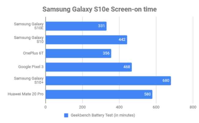
Geekbench Battery Test (Full Discharge)
The Galaxy S10E lasted 5 hours 31 minutes in the Geekbench battery test. 15 minutes of PUBG Mobile on the S10E drained the battery by around 10 percent which is quite a lot. Similarly 30 minutes of streaming Stranger Things Season 2 in HDR drained the battery down from 44 percent to 29 percent. Even during my daily usage for the three weeks I used the phone, the battery drained by one percent every three minutes which is alarming. I would be staring at an empty battery almost everyday around 5PM and even earlier if I’m out covering a launch event where the camera, messaging, Twitter and Instagram are all used simultaneously. In fact, we even asked for a replacement unit from Samsung and the replaced unit also reported the same.
The poor battery life of the phone is somewhat compensated by the fast 15W charging. It takes around an hour and 20 minutes to top up the phone to its max capacity. Incidentally, you can also charge the phone wirelessly in the same speed but you will need a 15W compatible Qi wireless charger for that. The phone also supports 9W reverse wireless charging which did charge my Galaxy Buds by 20 percent in around 30 minutes. It’s a gimmick of sorts and we won’t recommend using this feature to charge another smartphone as the phone does tend to get quite hot after some time of reverse charging.
Bottomline
The Samsung Galaxy S10E is proof that phones don’t have to come in a giant footprint to be deemed powerful. Sometimes, the smallest packages pack the largest punch and the Galaxy S10E does just that. It’s performance and the camera quality is more or less similar to the Galaxy S10 and the Galaxy S10+. While you’re unlikely to miss the larger display or the extra cameras, the disappointingly short battery life is sure to rain on the S10E’s parade. Just remember to keep a charger handy all the time. For an otherwise fantastic package, the battery life is a big let down and is the only reason why I’d recommend the Galaxy S10 over the S10E. We will be keeping a close eye on the software updates pushed out by Samsung over the next few months and will report in case the battery life improves.
[embed]https://www.youtube.com/watch?v=Dtau9NQFow8[/embed][ad_2]
Source link

Post a Comment